banner img
  • Home
  • Forums
  • Register
  • Contact Us

KINGDOM HEARTS 20th anniversary trailer + event announced

Kingdom Hearts Series Coming to Nintendo Switch as Cloud Versions

Sora from Kingdom Hearts announced as a new DLC fighter in Super Smash Bros. Ultimate

  • All
  • News
  • Interviews
  • Features
  • Editorials
  • Merchandise
  • KINGDOM HEARTS IV
  • KINGDOM HEARTS MISSING-LINK
  • Dark Seeker Saga
  • KINGDOM HEARTS III
  • KINGDOM HEARTS Melody of Memory
  • KINGDOM HEARTS χ series
  • MOBILE
  • The World Ends With You
  • NEO: The World Ends With You

RECENT DISCUSSION TOPICS

  • i played re:mind again.
  • Place your bets (Part 1)
  • GameStop Exclusive Funko POP! Kingdom Hearts Sora figure coming June 2023
  • KINGDOM HEARTS III Manga Volume 3 releasing March 2023 in Japan
  • About time travel... (Fun discussion)
  • About the Master Keeper Keyblade... (Fun discussion)
  • I FINALLY BEAT YOZORA!!!
  • About The Toy Box... (Fun discussion)
  • The Disney Castle characters and their inconsistent journal entries
  • KINGDOM HEARTS -HD 1.5 + 2.5 ReMIX- OSTs available on streaming services

MULTIMEDIA

  • Submissions
  • Avatars
  • Signatures
  • Wallpapers
  • iPhone Wallpapers
  • PSP Wallpapers
  • PS Vita Wallpapers
  • Video Game MIDI files
  • Video Game Music
  • Anime Downloads

COMMUNITY SPOTLIGHT

Elsa, Anna, Rapunzel, and Kairi make up four of the new Princesses of Heart. Come theorise who the last three Princesses will be!

NEWSLETTER

Subscribe to Kingdom Hearts News!

Enter your email address:


KHINSIDER

  • Membership FAQ
  • Contact Us
  • About Us
  • Staff
  • Affiliation

POLL

Who do you prefer to play as in Kingdom Hearts 3D?

Sora - 100%
Riku - 0%

Total votes: 1, but the poll doesn't work yet
View details
read the related article >>

A Look Back: KINGDOM HEARTS Ultimania Gallery Comments Part 2

Details
Published on September 4, 2019 @ 06:16 am
Written by Cecily
Tweet

Continuing our revisit of lesser-known interviews and the like, here is Part 2 of the art gallery comments from the Kingdom Hearts Ultimanias. This part covers the remaining titles from Chain of Memories through to Kingdom Hearts 3.

All comments are made by Tetsuya Nomura.

For Part 1 covering the original Kingdom Hearts, check out our previous article!

As always, many thanks to goldpanner for her hard work in translating! If you'd like to say thanks, please consider buying her a coffee!

Sea: This is my favorite thing I drew for KH2. That's why I've used it in so many places. It also comes with many memories, like how I went through hell coloring this picture due to technical difficulties. I had trouble thinking of a title, which is why it is so simple.

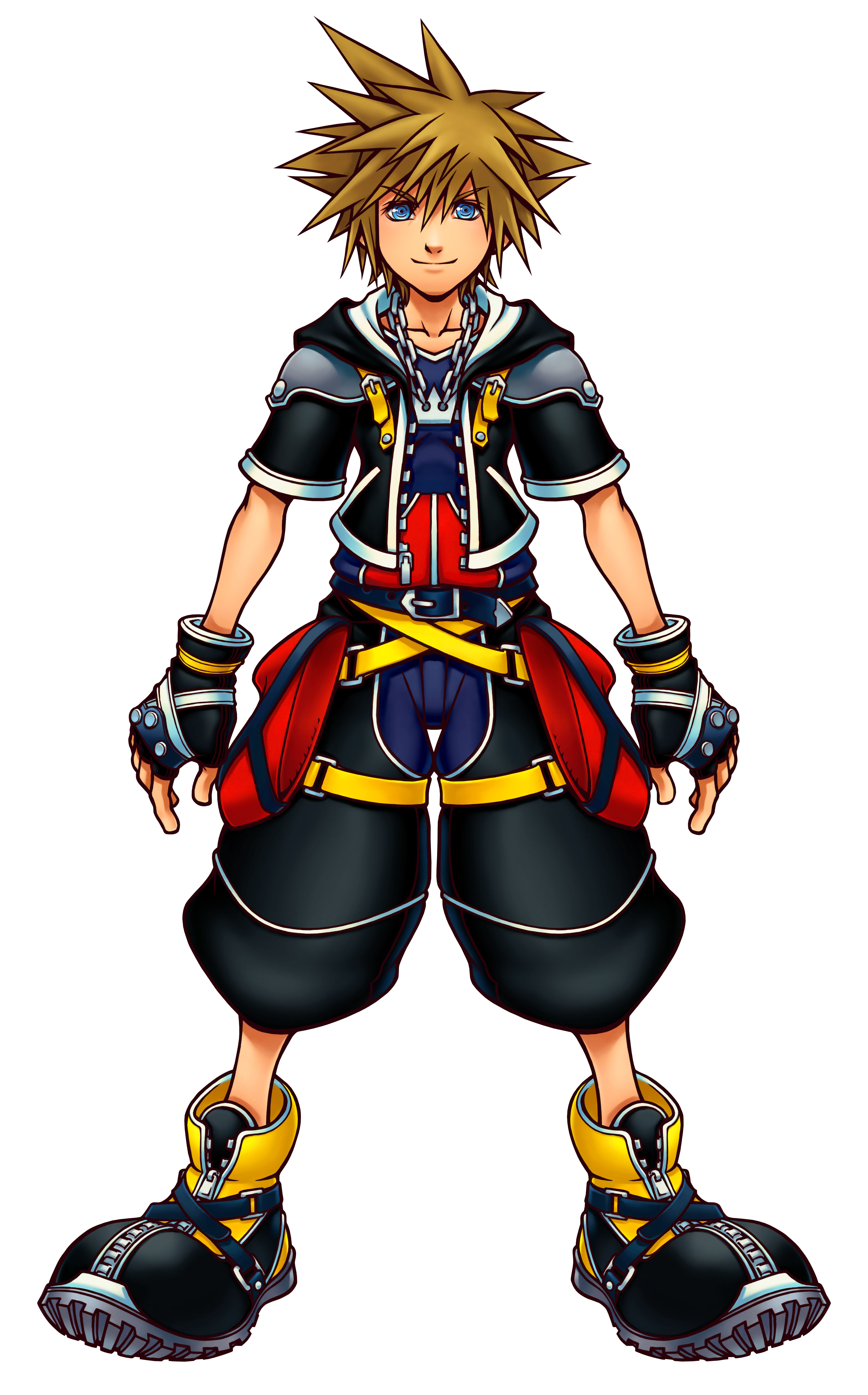
Sora: You might think he's grown up too much, but he's at an age where he grows fast. The lightening of his hair is due to Roxas' influence. Sora's characteristic hair side spikes are more vertical than before - did you notice? I made his clothes black, with form changes in mind. It was a lot of work drawing the gloves and wallet chain on his old outfit every time, so I got rid of them.

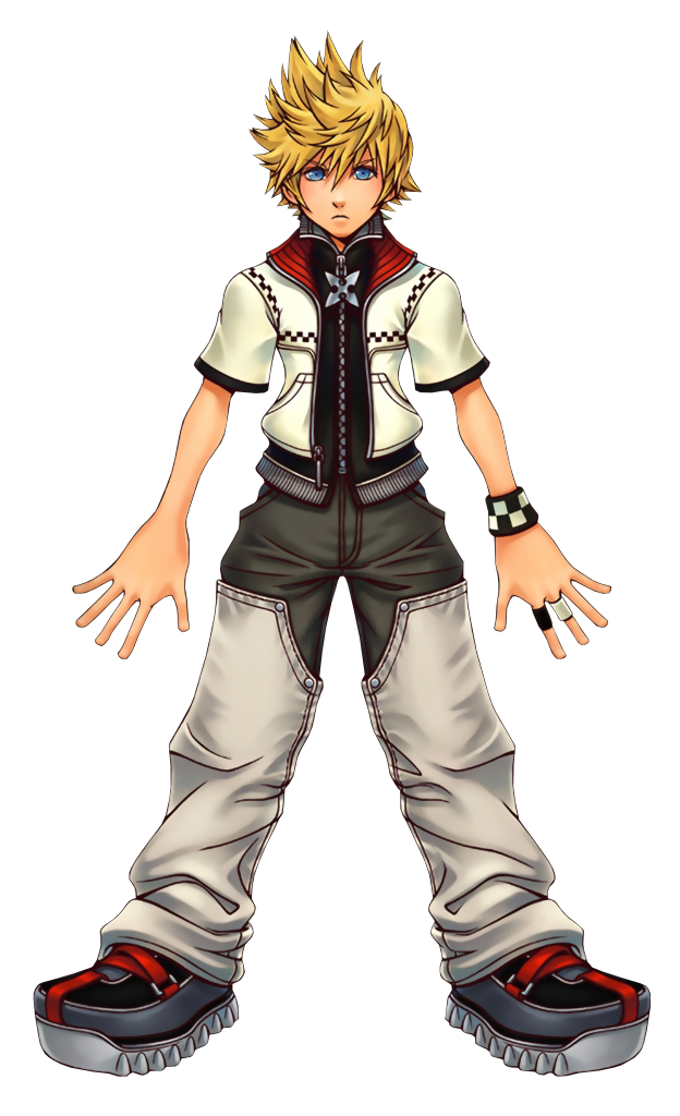
Roxas: I traced Sora for this piece. My image of Roxas actually came first, before Sora, and I had already drawn him for the first project document. The concept of "between" was something I kept in mind: since Sora's outfit was to be black this time, I made Roxas' base color white, and I also added a black and white checked pattern. The cross on his chest isn't a necklace, it's part of his zipper, and it is the motif of the Nobodies. Also, his hair is supposed to be the exact same length as Sora's.

Heart: I didn't actually originally draw this as box art, I planned to do something with Kairi in her usual clothes. But this was well received, and it was close to the idea I had for the box art anyway, so we just went with this. I went back and forth over whether to set it at sunset, but since this picture was presented around the time of the re-launch I gave it a bright blue sky.

Invitation: This is the earliest thing I drew for a KH2 announcement, so it doesn't include the new characters yet. Due to the timing there were still many characters whose faces I couldn't show, which made it tough to draw. But, I didn't have time to spare, so I finished it with a few characters.

Awakening: This is something else I drew on a tight schedule. I wanted to try making a new picture that used all the elements we had at that point. I was relieved, the composition using old Sora and new Sora turned out a lot better than expected.

Duality: This is actually what I had intended to use for the box art. Not exactly as it is, of course… That's why it utilizes images of hearts. The concept was: Sora and Roxas, Kairi and Namine, and then contrasting characters on the right and left.

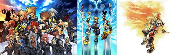
Sunset & Daylight: I hadn’t drawn a PR pic that included Organization XIII, and that made me want to draw something with the full cast… and that was the beginning of my misfortunes… I didn’t imagine it would become such a huge piece. But, when I look at the finished product, it does have impact, which is good. It was first revealed at the 2006 Tokyo Game Show, and lots of people gathered to look. I saw fans not moving away from the picture even when the event was closing, and that made me so happy. I was moved.

Exhilarating: This is based on the KH-esque open sky and open sea. The back of the box art features Sora and Riku from KH Re:COM - conceptually, this is the official art. They’re doing a good job keeping balance on such tiny platforms, you may think, but that’s because, well. Umm… It’s deep, right? I’m sure.

Late Summer: This never happens in the game, but I got a flash of inspiration and drew this picture in one sitting. I like the slightly sad atmosphere.

Crossroads (Morning Star): There’s a folk story about a guitarist who makes a deal with the devil at a crossroads. That was actually the inspiration for the opening of KH CoM.

(Note: Nomura is referring to the legend of Robert Johnson.)

Crossroads (Dawn): I am really sorry. By the time I noticed, it was already too late. The color of Riku’s clothes is wrong. It’s been published like this, exposing my idiocy to everyone. Fans, please accept my apologies.

(Note: The back of Riku's shirt is supposed to be black. View the corrected version here.) 

Deck: We were making a 3D video for an in-house presentation, and we storyboarded a part where Sora sits on his Keyblade and spreads out a deck of cards. That sequence was well received, so I made it into an illustration. It rarely happens in that order.

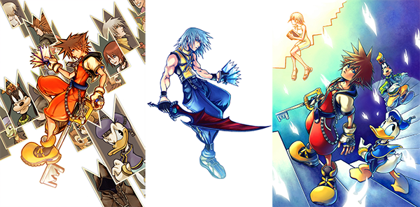
Card: Side Riku needed a title screen, so I made this in a hurry. I made it symmetrical to Sora’s, so we could put them together for PR use.

Spiral: I planned to put a lot more into this drawing, but tragically I ran out of time. As such, I finished up a simple version. This is off topic, but although I am not the type to save my original illustrations carefully, I also never give them to people. However, once there was someone I really wanted to give something to as a show of gratitude, and the original drawing for this picture happened to be at hand. Now, it is off in a distant city over the ocean.

Boundary: I started drawing this as a key visual, but I fell in love with the way Roxas is standing here and finished it up to use for the box art too. It was difficult to balance - even though each character is in a different place, there are no distinct lines to separate them. However, by creating a triangle shape that flows from the right foreground to the left background, I think I stabilized it. Each character is given a background that is meaningful to their story in the game - but the ground at Roxas’ feet is white. He stands somewhere with no background. The concept behind this is to hint at the game’s tagline: "What mattered the most was remembered the least."

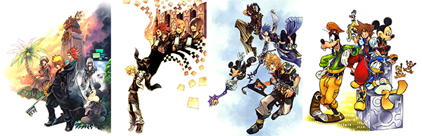
Recollection: I came up with this picture while thinking of something for the ending. As such, it’s constructed in a way that takes the double screens into account. I thought of several layouts to use in-game, and in the end we went with a resized version that doesn’t show the full picture. I was very glad that I had the chance to use the original for the cover of the Ultimania. Roxas is taking off the Organization’s trademark black coat, and the days he can never return to are vanishing, represented by the checked pattern associated with Roxas. The silhouette also looks like wings, which represents freedom.

Soar: The concept is that they are each beginning to move with their own purposes in mind. This is the instant that they leave their training, and fly from the nest into freedom. However, each of them have their own goals, destinations, and destinies - so they are all gazing in different directions, and their expressions are different. I usually like to use still images for key visuals, but this time I wanted to add a little movement.

Smile: I drew this because the PR team leader asked me to draw a key visual with a fun, bright tone like that of KH1. Of course, we have been releasing serious games recently, and it wouldn’t fit for the box art or title screens to feature grinning illustrations - so my art had been getting more subdued. KH Re:coded is a more cheerful game, so a picture with everyone smiling is perfect.

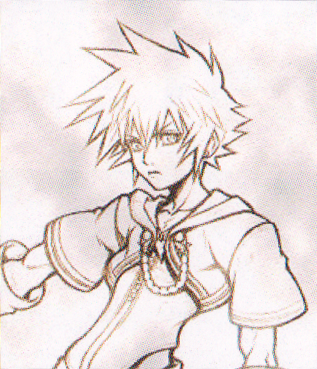
PV Storyboards [1] [2] [3]: I usually don’t draw storyboards for trailers, but as this was created at the very beginning of development and I had some time, I drew this. I drew this fully expecting a scene like this to appear in KH Coded.

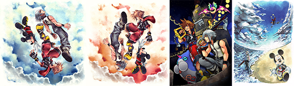
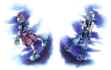
Sea of Clouds: Since the composition of the first picture I drew, Distance, was too bold to use easily, I quickly drew this new piece. With ease of use in mind, I drew each of the three on separate layers and organized it so their positions could be adjusted. Even though I drew it in a rush, I like it. I think I managed to convey the tagline in a simple way: "Darkness becomes light, light falls into darkness."

Twilight: While drawing Sea of Clouds, I thought it was meaningful that it could be looked at upside down. So, I made another version just in case. The Japanese word “hakumei” can refer to the light of both sunrise and sunset, and since this is a picture where it could be either, I made that the title. It’s not a simple reversal of Sea of Clouds: is Riku falling to save Sora, or is Sora rising out of reach? It can be seen both ways. Sea of Clouds actually has the same meaning.

Entrance to the Dream: A key visual didn’t exist even after the title was announced, which made life difficult for the PR team, so I made this in a hurry to coincide with an event. This was around the time we decided on Sora and Riku’s new outfits, and the first Spirits that would be your partners. It had been a while since I’d drawn a KH picture, and I think you can tell that my mojo hadn’t quite come back.

Distance: When I draw KH art, I always keep in mind what kind of pictures they draw at Disney. But, I think this piece has the most bold composition so far. I like this picture because, along with the title, you can imagine all sorts of things. It was so bold that it was unusable as box art or for the title screen.

Promise: Sora at the water’s edge, like I have always drawn for the numbered titles. Perhaps you noticed, but over the course of the three games he has gradually turned his back. He looks as though he might go running off, but in his hand he holds a paopu fruit: a promise to meet again. It hints at the story of the game.

Gathering: I wanted to draw this with the same sense of balance as Premonition, the box art from the first game. But, there were too many characters, and I had to give up. I purposefully drew them with no expressions, and instead made it so that you feel their expressions from the background.

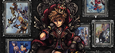
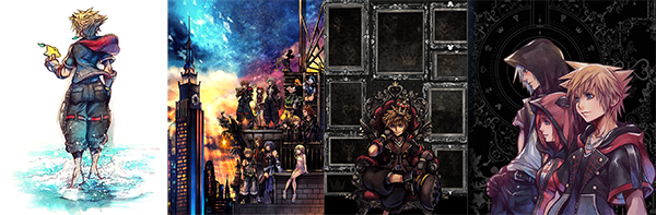
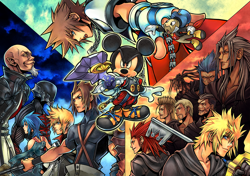
Crown: I drew the original picture as a present for friends who had worked alongside me on the KH series for many years, and inside the frames I drew characters from other titles we had worked on together. After that, Sora from the middle was revealed when we cut him out to use for the KH 15th anniversary. This is a version I refined to use for KHIII. I increased the number of frames, thinking they could be used as needed. In the end, they were left blank - the final product is up to the viewer.

3: I drew the original picture for the 3rd anniversary of KHUX. That was when we revealed these three characters’ KHIII outfits, which made me want to use it for the actual KHIII, so I rearranged it. I used a pattern from the KHIII main artwork for the background. I personally love Sora’s face in this picture.

To see more, visit our image galleries for Kingdom Hearts II,  Chain of Memories, 358/2 Days, Birth by Sleep, coded, Dream Drop Distance, and Kingdom Hearts 3!

Follow Kingdom Hearts Insider on Facebook, Twitter, and Tumblr for the latest updates on Kingdom Hearts Union χ [Cross], Kingdom Hearts 3 and all things Kingdom Hearts! 

COMMENTS

+ Reply

okhi12

September 4, 2019 @ 05:38 pmOffline

comment graphic

Thank you very much, Sign and goldpanner!
I was eagerly waiting for Part 2, but I thought it would take you more time. It has been a pleasant surprise!
I didn't know Nomura's thoughts about each drawing, it was a very interesting read.
I find particularly interesting that the lightening of Sora's hair in KH2 is because of Roxas, I had no idea. I know it is just a conceptual detail and I shouldn't give it much thought, but I wonder how that works, because it looks like the hair lightening took place when Sora was inside the memory pod and Naminé was restoring his memories, not when Roxas was created. Maybe it was supposed to happen when Roxas returned to him, but I'm sure that Sora's hair was already lighter when the pod opens and Roxas sees Sora before returning to him. Well, maybe they didn't care to create a model of Sora with darker hair just for the five seconds Sora appears there sleeping before Roxas says his vacations are over. Interesting nonetheless.

Oracle Spockanort

September 4, 2019 @ 05:38 pmOffline

comment graphic

So, we weren't wrong when we speculated that the images had various TWEWY, FF, and Disney characters. They just weren't meant for US to see because they didn't mean anything in regards to KH3.

Also I'm howling at Nomura over Crossroads (Dawn).

Zettaflare

September 4, 2019 @ 06:02 pmOffline

comment graphic

So the original KH2 box art would have had Kairi in her normal outfit. Funny that she was in her school uniform in the final product when it was only used for one scene.


Still wish we could have seen Sora and Riku in school uniforms, lol

Oracle Spockanort

September 4, 2019 @ 06:04 pmOffline

comment graphic

Zettaflare

So the original KH2 box art would have had Kairi in her normal outfit. Funny that she was in her school uniform in the final product when it was only used for one scene.


Still wish we could have seen Sora and Riku in school uniforms, lol


If we start a campaign for it, maybe Nomura will look at it, throw a sandwich at the trash in anger, and then make it happen because he's a sucker for costume design.

Sakuraba Neku

September 4, 2019 @ 09:12 pmOffline

comment graphic

Yo, Boundary blew my mind!

I hadn't realized this "Each character is given a background that is meaningful to their story in the game - but the ground at Roxas’ feet is white. He stands somewhere with no background. "

Can't thank you enough for the hardwork - Sign and Goldpanner!

Twilight Lumiair

September 4, 2019 @ 11:22 pmOffline

comment graphic

Fascinating! It's always an awesome feeling when you can look back at a picture you've seen a thousand times and notice something new. I think the ones that stuck out to me the most are

Boundary

and

Recollection

.

With

Boundary

, the way the characters and the backgrounds were balanced always felt a little.. off to me for some reason (I think it might be because of abrupt triangular cut off). Like, I could tell the perspective and symmetry was definitely there, but I couldn't figure what the logic behind all the placements was. Hearing Nomura's explanation helped me shift my understanding and see the picture more for what it was supposed to be. It's still not my favorite, but I love it all the more now.

Interestingly enough,

Recollection

actually was always one of my favorites. Not just because I love the characters, but the clever symbolism, as well as how beautifully it sums up Roxas' journey in one stroke (connecting both of his stories), is really something to behold. What I never noticed was how the silhouette of the coat subtly formed the shape of wings, and that easily miss-able detail held the important symbolism of freedom ?. Like, wow.. It's just so deep, and adds more layers to an already well-constructed picture.

SweetYetSalty

September 5, 2019 @ 12:01 amOffline

comment graphic

I enjoyed reading the stuff behind those pictures. I always love viewing official Kingdom Hearts art like this and now I have a new reason to love them.

Sign

September 5, 2019 @ 12:54 amOffline

comment graphic

Forgot I had this pic until after the article went live but this is the concept art of Roxas Nomura is referring to, from the project document.

Zettaflare

September 5, 2019 @ 01:09 amOffline

comment graphic

Sign

Forgot I had this pic until after the article went live but this is the concept art of Roxas Nomura is referring to, from the project document.


If it wasn't for Ventus I could definitely see Roxas looking like that. This version looks far more like Sora but with a bit of difference to make him distinct

Oracle Spockanort

September 5, 2019 @ 01:33 pmOffline

comment graphic

Sign

Forgot I had this pic until after the article went live but this is the concept art of Roxas Nomura is referring to, from the project document.


Man, I absolutely love this. Also look at how the outfit is xD it’s a leotard that shows off Roxas’ hips with low hip hugging bottoms xD

FudgemintGuardian

September 5, 2019 @ 01:49 pmOffline

comment graphic

Sign

Forgot I had this pic until after the article went live but this is the concept art of Roxas Nomura is referring to, from the project document.


I like to think this is how Roxas would have looked if he kept Sora's memories.

Elysium

September 5, 2019 @ 10:43 pmOffline

comment graphic

I actually don't think I've ever seen "Distance" before, but it's beautiful.

Twilight Lumiair

September 6, 2019 @ 01:16 amOffline

comment graphic

Tartarus

I actually don't think I've ever seen "Distance" before, but it's beautiful.

Same. It's the only promotional artwork I don't I've ever seen for DDD. Still a solid peice though.

Sign

September 6, 2019 @ 02:39 amOffline

comment graphic

BTW here's an early concept art of Twilight Town also from the KH2 project doc, looking very different from the modern French countryside it's based off of in the final product.

Zettaflare

September 6, 2019 @ 02:57 amOffline

comment graphic

Sign

BTW here's an early concept art of Twilight Town also from the KH2 project doc, looking very different from the modern French countryside it's based off of in the final product.


Looks very cartoony and I'm glad it wasn't the final product. Would not have fit the tone of the prologue.

Kind of resembles the garden area of Disney Castle

Twilight Lumiair

September 6, 2019 @ 03:09 amOffline

comment graphic

Sign

BTW here's an early concept art of Twilight Town also from the KH2 project doc, looking very different from the modern French countryside it's based off of in the final product.


I can't even clearly tell what this is supposed to be (mostly because of the lighting and odd coloring choices). Is there some sort of moat around the center? Is that supposed to be a hill with houses in the middle, or some kind of mushroom tower? I know the final design had the town on a sloped mountain, but I don't think that's what this was going for. What are the buildings even made of? Are the trains on a floating track, or is it just some sort of bridge without the supports?

In general though, I think it's an interesting design for a location, and it could easily fit as an original world within the universe of KH, provided it's not as cartoony and more defined in its structure.

Sign

September 6, 2019 @ 05:25 amOffline

comment graphic

Zettaflare

Looks very cartoony and I'm glad it wasn't the final product. Would not have fit the tone of the prologue.

Kind of resembles the garden area of Disney Castle


It reminds me a lot of older FF games. The vibe is nice, would have been interesting to see it realized but the one we got is perfect.

...

There's one piece of artwork that I wish Nomura had commented on but this thing never sees the light of day anymore, for some bizarre reason. It was used a lot in early promotion and then vanished off the face of the earth. Isn't in any of the Ultimanias either :(

LightUpTheSky452

September 7, 2019 @ 03:13 amOffline

comment graphic

Some really interesting things here!

I don't think I'm going to pick it apart as much as I did the KHI Ultimania post, but some thoughts off the top of my head are:

It's nice to have Sora's lighter hair in KHII being because of Roxas, confirmed.

It's cool to hear that Nomura thinks of how Disney does their art when doing his own for KH:)

The information about "Crossroads" is really interesting...

I love how Nomura said that the KHIIFM characters can balance on the poles for a "deep reason". LOL.

Nomura beating himself up about Riku's shirt being wrong, is a moment we've all had with our own work: I'm sure.

Aaaaaand the title screen for KHIII makes so much more sense now (though not that it completely didn't before), given Nomura's description there. -sobs- Sora will make it back to Kairi. He will. And it's interesting to know that he faces away more and more with each main game's title screen. I hadn't caught that. I wonder if that means next saga he'll start facing the camera more and more again... since I have a bad feeling that Sora and Kairi are going to be kept apart most of the next saga, and then finally have some epic ending where they can finally stay together in the last game's ending or something. But if you're going to do this, Nomura, can I at least ask you give them some moments together--before they're inevitably torn apart by fate again--and give them parallel journeys ala Buffy and Angel,Jon and Daenerys (before that got royally screwed up, I mean), or even Noctis and Luna (though maybe slightly done better done than that?), that help us see how they'd be good together through that if nothing else?

[USER=89972]@Sign[/USER] That original concept for Twilight Town reminds me a bit of Traverse Town meets Deep Jungle:) And Nomura probably doesn't talk about that piece anymore, because he's ashamed of how Roxas looks way older than he's supposed to there;)

FudgemintGuardian

September 9, 2019 @ 12:06 amOffline

comment graphic

Sign

BTW here's an early concept art of Twilight Town also from the KH2 project doc, looking very different from the modern French countryside it's based off of in the final product.


What in fresh heck is this?!?!

Everything's all....green and mushroom-y. It's hard to believe what we got could be so different.

Huh. Actually, Mysterious Tower wouldn't look all that out of place here.


Sign

There's one piece of artwork that I wish Nomura had commented on but this thing never sees the light of day anymore, for some bizarre reason. It was used a lot in early promotion and then vanished off the face of the earth. Isn't in any of the Ultimanias either :(


How strange. One of my top favorites too.

GreyouTT

September 9, 2019 @ 03:05 amOffline

comment graphic

Sign

BTW here's an early concept art of Twilight Town also from the KH2 project doc, looking very different from the modern French countryside it's based off of in the final product.


Is it on pillars over water?

This looks really cool though, I kinda want the concept to get reused.

Absent

September 9, 2019 @ 04:11 amOffline

comment graphic

To this day my favorite is still “Recollections”. I’ll never forget the day I beat 358/2 Days. I remember vividly rushing home after school and locking myself in my room to finish it.
When everything falls apart and there’s nothing you can do but keep playing, hoping something good can come out of it.

I was a mess, sobbing while Sanctuary played during the credits. At the end, that image.

Roxas falling with his eyes closed. Arms stuck to his coat, like his past is holding onto him as it slowly comes apart. The image destroyed me.
That’s the strongest and most visceral emotion Kingdom Hearts ever got out of me.

I will say the DDD images feel so different to me from the rest. Maybe it’s because I had the Mark of Mastery edition so seeing the Mickey one fills me with slight nostalgia.

+ Reply

footer image

Since 2003, KINGDOM HEARTS Insider has been the largest fan community and news resource on the web for the series. We are your one stop shop for all your KINGDOM HEARTS news, media, discussion, and fandom, from the original, to Birth by Sleep, KINGDOM HEARTS 3, and beyond!

  • Video Game Music
  • Zophar's Domain Emulation
  • Final Fantasy Extreme
  • KH World

©2016 KHInsider. KINGDOM HEARTS official artwork, trailers, characters, merchandise, and music is copyrighted to Square Enix and Disney.
Original material is licensed under a Creative Commons License permitting non-commercial sharing with attribution.
Please read our privacy policy for more information | Legal Information