
You are using an out of date browser. It may not display this or other websites correctly.
You should upgrade or use an alternative browser.
You should upgrade or use an alternative browser.
Spiral Dream Designs - Greatest Shop In Existence
- Thread starter Zook
- Start date
|
REGISTER TO REMOVE ADS |
|
- Status
- Not open for further replies.
- Joined
- Apr 5, 2006
- Messages
- 4,628
- Location
- On the outer rim of the local ghetto
- Website
- kazu52.deviantart.com
Re: \/~Spiral Dream Designs~\/

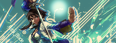
Here you go SR, sorry I couldn't stick to the colors all the way.
Here you go SR, sorry I couldn't stick to the colors all the way.
- Joined
- May 10, 2006
- Messages
- 11,535
- Awards
- 8
- Location
- mISSING SOMEWHERE On sIGLUR****
- Website
- www.facebook.com
Re: \/~Spiral Dream Designs~\/
lulz, am I supposed to care about something like that with these gorgeous results??
lulz, am I supposed to care about something like that with these gorgeous results??
Re: \/~Spiral Dream Designs~\/
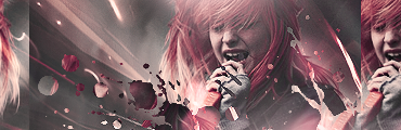
Fatal_Blade's tag:
Towards the end, I was like, "Where the hell do I put the text??" :/ personally I think of typography as my worst part.
Fatal_Blade's tag:
Towards the end, I was like, "Where the hell do I put the text??" :/ personally I think of typography as my worst part.
Last edited:
- Joined
- Jun 13, 2005
- Messages
- 667
- Age
- 31
Re: \/~Spiral Dream Designs~\/
Hope i dont get to complicated
Stock: http://digital-monsters.iespana.es/images/rapidmon.jpg
To the right side
http://www.dotphoto.com/SAN1/E1/88/AA/iE188AACF-7F5D-4EF9-9B5C-FD793C73CE98.jpg just the digimon
to the left
Size: 400x150
Colors: Shades of emerld green and any other color you think would balance it out
if you could make the backround a design like this http://i31.tinypic.com/2e33jvr.gif
Text: Its our destiny to save the world.
Avatar: [Y]
Artist: Kaz please : )
Re: \/~Spiral Dream Designs~\/
That tag's really good. But if i were you, i would've made the text flow with the shapes.
Fatal_Blade's tag:
Towards the end, I was like, "Where the hell do I put the text??" :/ personally I think of typography as my worst part.
That tag's really good. But if i were you, i would've made the text flow with the shapes.
- Joined
- May 10, 2006
- Messages
- 11,535
- Awards
- 8
- Location
- mISSING SOMEWHERE On sIGLUR****
- Website
- www.facebook.com
Re: \/~Spiral Dream Designs~\/
lol, I am so bored an need practice. I need requests. Tryin new stuff can be fun, but not all the time when there is nobody to see it, or appreciate it.
lol, I am so bored an need practice. I need requests. Tryin new stuff can be fun, but not all the time when there is nobody to see it, or appreciate it.
- Joined
- Dec 23, 2007
- Messages
- 9,638
- Awards
- 3
Re: \/~Spiral Dream Designs~\/
Stock: http://mi3.com.ua/uploads/photos/2008/03/28/panic_at_the_disco_pretty_odd_20081.jpg
http://images.starpulse.com/Photos/Previews/Panic-at-the-Disco-04.jpg
Size: 135x445
Colors: dark blue, greens
Text: Nine in the Afternoon
Avatar: No thx
Artist: Shattered Redemption please
Stock: http://mi3.com.ua/uploads/photos/2008/03/28/panic_at_the_disco_pretty_odd_20081.jpg
http://images.starpulse.com/Photos/Previews/Panic-at-the-Disco-04.jpg
Size: 135x445
Colors: dark blue, greens
Text: Nine in the Afternoon
Avatar: No thx
Artist: Shattered Redemption please
- Joined
- May 10, 2006
- Messages
- 11,535
- Awards
- 8
- Location
- mISSING SOMEWHERE On sIGLUR****
- Website
- www.facebook.com
Re: \/~Spiral Dream Designs~\/
i am just a tad annoyed now, well more than that. I was working on your sig since three minutes after you request it, and just as I was about to add the text, photoshop completely froze on me...........
This has got to be the biggest load of shite ever.....
So I'll do it again later today as right now I am just gonna go to sleep on an angry as hell note.
Edit: Yeah, so i did it AGAIN, and this one did not come out the same as the one that got corrupted. I am really not as pleased with the results, but Meh.
Last edited:
Re: \/~Spiral Dream Designs~\/
Can you guys tell me what you think of my newest tag. I made it through a request.
I was thinking maybe putting a reddy-orangy line next to the images on the sides, a little like V_A's first request here.
Can you guys tell me what you think of my newest tag. I made it through a request.
I was thinking maybe putting a reddy-orangy line next to the images on the sides, a little like V_A's first request here.
- Joined
- May 10, 2006
- Messages
- 11,535
- Awards
- 8
- Location
- mISSING SOMEWHERE On sIGLUR****
- Website
- www.facebook.com
Re: \/~Spiral Dream Designs~\/
I like it Eli. It maybe could use just a tad more lighting, but just a tad. Maybe I'm wrong, but those C4Ds blended in nicely.
Well, I really Did like the first result better, but I mean it is more of an abstract look than anything else.
I like it Eli. It maybe could use just a tad more lighting, but just a tad. Maybe I'm wrong, but those C4Ds blended in nicely.
It isn't too bad young grasshopper (lulz). =D
Well, I really Did like the first result better, but I mean it is more of an abstract look than anything else.
- Joined
- Apr 5, 2006
- Messages
- 4,628
- Location
- On the outer rim of the local ghetto
- Website
- kazu52.deviantart.com
Re: \/~Spiral Dream Designs~\/
the link to the stock isn't working........Hope i dont get to complicated
Stock: http://digital-monsters.iespana.es/images/rapidmon.jpg
To the right side
http://www.dotphoto.com/SAN1/E1/88/AA/iE188AACF-7F5D-4EF9-9B5C-FD793C73CE98.jpg just the digimon
to the left
Size: 400x150
Colors: Shades of emerld green and any other color you think would balance it out
if you could make the backround a design like this http://i31.tinypic.com/2e33jvr.gif
Text: Its our destiny to save the world.
Avatar: [Y]
Artist: Kaz please : )
Re: \/~Spiral Dream Designs~\/
I inspired you? :3
I don't like any of the clipping masks that much except the splatter one on the right. The splatter ones near the mid-left are too in your face. Tone down that one's saturation, darkness, and sharpness a bit. I'd take out both the ones on the side and put one on the left of Hayley's face or of something else that's interesting with a good colored stroke. Two is just overdoing it. I feel the tag needs more color. You have rather dull colors with a stock that has a lot of action in it. I do like the color combination though. I just feel that their needs to be a little more color to get that action-y feel going. Also, lighting is wierd. It's coming from places that aren't reflected well on the stock. The lighting is coming from her upper right, but yours is coming from above and below her.
Stock, please. I love Hayley stocks. :<
I'll do Cherry's by tomorrow afternoon. Gotta clean my room and go to lifeguard training.
Expect it between now and about 6PM tomorrow.
Finished your tag, Cherry:
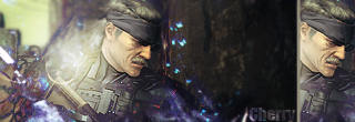
Let me know if you have any problems with it.
Can you guys tell me what you think of my newest tag. I made it through a request.
I was thinking maybe putting a reddy-orangy line next to the images on the sides, a little like V_A's first request here.
I inspired you? :3
I don't like any of the clipping masks that much except the splatter one on the right. The splatter ones near the mid-left are too in your face. Tone down that one's saturation, darkness, and sharpness a bit. I'd take out both the ones on the side and put one on the left of Hayley's face or of something else that's interesting with a good colored stroke. Two is just overdoing it. I feel the tag needs more color. You have rather dull colors with a stock that has a lot of action in it. I do like the color combination though. I just feel that their needs to be a little more color to get that action-y feel going. Also, lighting is wierd. It's coming from places that aren't reflected well on the stock. The lighting is coming from her upper right, but yours is coming from above and below her.
Stock, please. I love Hayley stocks. :<
I'll do Cherry's by tomorrow afternoon. Gotta clean my room and go to lifeguard training.
Expect it between now and about 6PM tomorrow.
Finished your tag, Cherry:
Let me know if you have any problems with it.
Last edited:
Re: \/~Spiral Dream Designs~\/
aahh thanks veritas its hot
aahh thanks veritas its hot
Re: \/~Spiral Dream Designs~\/
I agree with the clipping mask nearest the left, my aim was strong effects, i went a little overboard though. I actually put 2 on the sides because the the stock size i wanted for the canvas just wasn't wide enough lol. And colour was a big issue on this for me. I just couldn't get anything to work. As for the lighting, i couldn't see much lighting on the stock because of the computer i'm using, so i just put it where i thought would look best >< Next week will be better because i'll be using my girlfriends comp and it's got better contrast ^^
Thanks alot for the crit ^^
Edit: Stock;
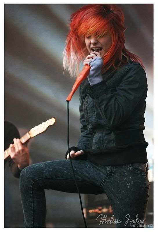
It may have been resized by photobucket, if it has just go to Paramore's images on Myspace.
I inspired you? :3
I don't like any of the clipping masks that much except the splatter one on the right. The splatter ones near the mid-left are too in your face. Tone down that one's saturation, darkness, and sharpness a bit. I'd take out both the ones on the side and put one on the left of Hayley's face or of something else that's interesting with a good colored stroke. Two is just overdoing it. I feel the tag needs more color. You have rather dull colors with a stock that has a lot of action in it. I do like the color combination though. I just feel that their needs to be a little more color to get that action-y feel going. Also, lighting is wierd. It's coming from places that aren't reflected well on the stock. The lighting is coming from her upper right, but yours is coming from above and below her.
Stock, please. I love Hayley stocks. :<
I agree with the clipping mask nearest the left, my aim was strong effects, i went a little overboard though. I actually put 2 on the sides because the the stock size i wanted for the canvas just wasn't wide enough lol. And colour was a big issue on this for me. I just couldn't get anything to work. As for the lighting, i couldn't see much lighting on the stock because of the computer i'm using, so i just put it where i thought would look best >< Next week will be better because i'll be using my girlfriends comp and it's got better contrast ^^
Thanks alot for the crit ^^
Edit: Stock;
It may have been resized by photobucket, if it has just go to Paramore's images on Myspace.
- Joined
- Jun 13, 2005
- Messages
- 667
- Age
- 31
Re: \/~Spiral Dream Designs~\/
Hope i dont get to complicated
Stock: http://www.dotphoto.com/SAN1/E1/88/A...793C73CE98.jpg just the digimon
http://i65.photobucket.com/albums/h236/Dylan1232/Brawl/thumbnail.jpg
Size: 400x150
Colors: Shades of emerld green and any other color you think would balance it out
if you could make the backround a design like this http://i31.tinypic.com/2e33jvr.gif
Text: Its our destiny to save the world.
Avatar: [Y]
Artist: Kaz please : )
There should work now")
also, my idea was if you could use terriermon on the left side and have him like "digivolve" into Rapidmon
Terriermon left side, Rapidmon right side
get it ? :\
the link to the stock isn't working........
Hope i dont get to complicated
Stock: http://www.dotphoto.com/SAN1/E1/88/A...793C73CE98.jpg just the digimon
http://i65.photobucket.com/albums/h236/Dylan1232/Brawl/thumbnail.jpg
Size: 400x150
Colors: Shades of emerld green and any other color you think would balance it out
if you could make the backround a design like this http://i31.tinypic.com/2e33jvr.gif
Text: Its our destiny to save the world.
Avatar: [Y]
Artist: Kaz please : )
There should work now
also, my idea was if you could use terriermon on the left side and have him like "digivolve" into Rapidmon
Terriermon left side, Rapidmon right side
get it ? :\
- Joined
- May 10, 2006
- Messages
- 11,535
- Awards
- 8
- Location
- mISSING SOMEWHERE On sIGLUR****
- Website
- www.facebook.com
Re: \/~Spiral Dream Designs~\/
Hmm, anyone mind critiquing this tag??

Hmm, anyone mind critiquing this tag??
- Joined
- Apr 5, 2006
- Messages
- 4,628
- Location
- On the outer rim of the local ghetto
- Website
- kazu52.deviantart.com
Re: \/~Spiral Dream Designs~\/
The link to the main stock still isn't working........
The link to the main stock still isn't working........
- Status
- Not open for further replies.