banner img
  • Home
  • Forums
  • Register
  • Contact Us

KINGDOM HEARTS 20th anniversary trailer + event announced

Kingdom Hearts Series Coming to Nintendo Switch as Cloud Versions

Sora from Kingdom Hearts announced as a new DLC fighter in Super Smash Bros. Ultimate

  • All
  • News
  • Interviews
  • Features
  • Editorials
  • Merchandise
  • KINGDOM HEARTS IV
  • KINGDOM HEARTS MISSING-LINK
  • Dark Seeker Saga
  • KINGDOM HEARTS III
  • KINGDOM HEARTS Melody of Memory
  • KINGDOM HEARTS χ series
  • MOBILE
  • The World Ends With You
  • NEO: The World Ends With You

RECENT DISCUSSION TOPICS

  • The writing team on the series has shrunk dramatically
  • What’s the Cost of Developing a Mobile App with Advanced Features?
  • Geoff Keighley x Kingdom Hearts: The Complete Compendium
  • Headcanon Voices for Characters
  • Winx/Kingdom Hearts
  • Changed Opinions on KH Games
  • KH4 Tease (Real Or Not)
  • What are your thoughts on Demyx being the Master of Masters Theories?
  • Mufasa the Lion King/Kingdom hearts dark road
  • Birth By Sleep is VERY similar to the Disney Princesses

MULTIMEDIA

  • Submissions
  • Avatars
  • Signatures
  • Wallpapers
  • iPhone Wallpapers
  • PSP Wallpapers
  • PS Vita Wallpapers
  • Video Game MIDI files
  • Video Game Music
  • Anime Downloads

COMMUNITY SPOTLIGHT

Let us know what you hope to see when Kingdom Hearts IV is next shown off!

NEWSLETTER

Subscribe to Kingdom Hearts News!

Enter your email address:


KHINSIDER

  • Membership FAQ
  • Contact Us
  • About Us
  • Staff
  • Affiliation

POLL

Who do you prefer to play as in Kingdom Hearts 3D?

Sora - 100%
Riku - 0%

Total votes: 1, but the poll doesn't work yet
View details
read the related article >>

KINGDOM HEARTS HD 1.5 + 2.5 ReMIX Boxart Revealed!

Details
Published on January 28, 2017 @ 12:26 am
Written by Sign
Tweet

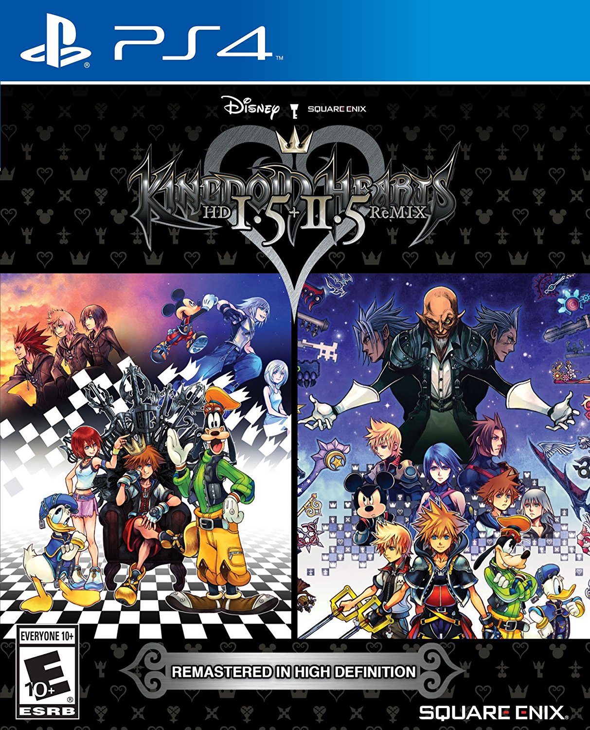
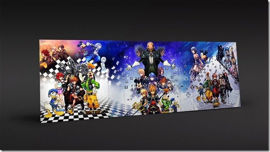
Series Director Tetsuya Nomura had confirmed in a recent interview that he would not be creating a new illustration for KINGDOM HEARTS HD 1.5+2.5 ReMix. Through Amazon, the cover art for this upcoming PS4 remaster has been revealed, depicting the illustrations of the original PS3 versions against a familiar argyle pattern.

UPDATE (2/1/2017): The boxart error where Xion was depicted handless has been fixed.

Source: Amazon.ca, KH Reddit

Follow Kingdom Hearts Insider on Facebook, Twitter, and Tumblr for the latest updates on Kingdom Hearts Unchained X, Kingdom Hearts 3, Kingdom Hearts HD 2.8 Final Chapter Prologue and all things Kingdom Hearts! 

COMMENTS

+ Reply

VoidGear.

January 28, 2017 @ 12:48 amOffline

comment graphic

Re: KINGDOM HEARTS 1.5+2.5 Boxart Revealed!

Woohoo three Soras on one box art we've already seen how thrilliiing.

It's like SE doesn't want us to buy this. They do realize a lot of people would consider buying it for a new cover alone, right?

Muke

January 28, 2017 @ 12:51 amOffline

comment graphic

Re: KINGDOM HEARTS 1.5+2.5 Boxart Revealed!

this honestly looks ugly :S
I liked the plain logo version much much better. Or they could've taken the box-cover and just cut 2.8 put. At least there would've been that nice transition.
Mh.

Chaser

January 28, 2017 @ 01:00 amOffline

comment graphic

Re: KINGDOM HEARTS 1.5+2.5 Boxart Revealed!

It's pretty damn good all things considered. Between Nomura saying he won't be drawing new art (gotta keep up his connection between all three titles) and how it's a collection like the Lego Harry Potter games (below), it was pretty obvious it would be both artworks side by side.

VoidGear.

January 28, 2017 @ 01:03 amOffline

comment graphic

Re: KINGDOM HEARTS 1.5+2.5 Boxart Revealed!

Chaser
It's pretty damn good all things considered. Between Nomura saying he won't be drawing new art (gotta keep up his connection between all three titles) and how it's a collection like the Lego Harry Potter games (below), it was pretty obvious it would be both artworks side by side.


See, I'm perfectly fine with THIS cover.
It's just the fact that the 1.5+2.5 cover doesn't even look nicely arranged like the Lego HP one. It's just this plain background with the covers added in. Like when the picture you decided to use as your desktop background isn't big enough. Meh.

Grizzly

January 28, 2017 @ 01:05 amOffline

comment graphic

Re: KINGDOM HEARTS 1.5+2.5 Boxart Revealed!

Chaser
It's pretty damn good all things considered. Between Nomura saying he won't be drawing new art (gotta keep up his connection between all three titles) and how it's a collection like the Lego Harry Potter games (below), it was pretty obvious it would be both artworks side by side.


I actually like how this was done. Not a huge fan of how they just slapped the two covers side by side for KH, it just feels lazy.

user avatar

Deleted member

January 28, 2017 @ 01:42 amOffline

comment graphic

Re: KINGDOM HEARTS 1.5+2.5 Boxart Revealed!

xion's missing hand is what clinches this as the best boxart.

VoidGear.

January 28, 2017 @ 01:44 amOffline

comment graphic

Re: KINGDOM HEARTS 1.5+2.5 Boxart Revealed!

Audo
xion's missing hand is what clinches this as the best boxart.


Lmao my flatmates should be awake now. Damn I laughed so hard. Didnt even catch that before.

Muke

January 28, 2017 @ 01:46 amOffline

comment graphic

Re: KINGDOM HEARTS 1.5+2.5 Boxart Revealed!

Nah, I think I'm gonna print out the original version. It just looks weird and, as I said, they should've used the version they had for the collection box just without 2.8. :/

WHY IS IT ALWAYS XION'S HAND xDDD

Oracle Spockanort

January 28, 2017 @ 02:12 amOffline

comment graphic

Re: KINGDOM HEARTS 1.5+2.5 Boxart Revealed!

Xion not having a hand should be canon. It is always missing in Nomura's art.

Absent

January 28, 2017 @ 02:52 amOffline

comment graphic

Re: KINGDOM HEARTS 1.5+2.5 Boxart Revealed!

Huh didn't know Xion was a Skywalker.

Hallowseve

January 28, 2017 @ 04:01 amOffline

comment graphic

Re: KINGDOM HEARTS 1.5+2.5 Boxart Revealed!

Xion's missing hand is OBVIOUSLY symbolic in a way! She faded away in Roxas' arms and then him and Axel forgot who she was. This signifies the moment they begin to forget who she was, her existence (mostly) erased. Thus her hand disappears.

Excellent symbolism used in this one, Nomura!

Taochan

January 28, 2017 @ 04:14 amOffline

comment graphic

Re: KINGDOM HEARTS 1.5+2.5 Boxart Revealed!

I can't stop cringing.

Nazo

January 28, 2017 @ 05:26 amOffline

comment graphic

Re: KINGDOM HEARTS 1.5+2.5 Boxart Revealed!

It looks good enough, but more could have been done with it to make it look less like a Photoshop fan mock-up. That negative space on the sides of the logo in particular is really bugging me. But oh well, it works for me. I like it, coulda been better, but it's fine.

kupo1121

January 28, 2017 @ 06:30 amOffline

comment graphic

Dear 'Potential Collector's Edition'...you're our only hope.

I'll be the minority here, but I really don't mind this cover. It's not trying to be a new game, but rather like so many 'Collection Boxarts' (God of War, Resident Evil, Jak & Daxter, etc.), it shows the buyer what you get inside rather than making people believe it's something new.

The only thing I don't get is "Remastered in High Definition" because I thought they were meant these were remastered remasters of the remaster games.

Chaser

January 28, 2017 @ 06:33 amOffline

comment graphic

kupo1121
Dear 'Potential Collector's Edition'...you're our only hope.

I'll be the minority here, but I really don't mind this cover. It's not trying to be a new game, but rather like so many 'Collection Boxarts' (God of War, Resident Evil, Jak & Daxter, etc.), it shows the buyer what you get inside rather than making people believe it's something new.

The only thing I don't get is "Remastered in High Definition" because I thought they were meant these were remastered remasters of the remaster games.

Wasn't Kingdom Hearts 1.5 remastered to like 720p and just upscaled to 1080p HD? Maybe they finally brought it up to full HD, and with PS4Pro users, they can get it in 4K.

Recon

January 28, 2017 @ 06:35 amOffline

comment graphic

Re: KINGDOM HEARTS 1.5+2.5 Boxart Revealed!

Audo
xion's missing hand is what clinches this as the best boxart.


Wow, good eye. This is quite hilarious.

Muke
this honestly looks ugly :S
At least there would've been that nice transition.


I didn't want to say it first, but I agree with Muke. Nomura is a great artist. His artwork shouldn't be scaled down, hiding the detail. Some form of transition or "Final Mix" version between the two pieces would have been cool. This is just lazy.

Nazo
It looks good enough, but more could have been done with it to make it look less like a Photoshop fan mock-up. That negative space on the sides of the logo in particular is really bugging me. But oh well, it works for me. I like it, coulda been better, but it's fine.


I mean, have you seen the latest updates to the official KH website (hub)?

FudgemintGuardian

January 28, 2017 @ 05:20 pmOffline

comment graphic

Xemnas found Xion wasn't very handy to have in the Organization.~


Ugh, this cover.
It took the liberty of editing the covers together.
[SPOILER=Too much?]

[/SPOILER]

Oracle Spockanort

January 28, 2017 @ 06:23 pmOffline

comment graphic

They could have just gone the 15th Anniversary box route and made the two covers flow into each other...

BufferAqua

January 28, 2017 @ 06:57 pmOffline

comment graphic

FudgemintGuardian
Xemnas found Xion wasn't very handy to have in the Organization.~


Ugh, this cover.
It took the liberty of editing the covers together.
[SPOILER=Too much?]

[/SPOILER]

Please call Square Enix.

Muke

January 28, 2017 @ 07:34 pmOffline

comment graphic

FudgemintGuardian
Xemnas found Xion wasn't very handy to have in the Organization.~


Ugh, this cover.
It took the liberty of editing the covers together.
[SPOILER=Too much?]

[/SPOILER]

While this surely is a better idea (they should do this), this one really looks convulted imo

Hirokey123

January 28, 2017 @ 07:46 pmOffline

comment graphic

Huh when you count them all there are the same number of "Soras" as there are "Roxas/Ventus" on the covers. One Sora and One Roxas on 1.5 and Two Sora and Two Roxas on 2.5...and technically chronologic to since Data Sora is a past version of Sora and Ventus could be considered in some respects to be a past version of Roxas. Doesn't compare to like the 6 norts/nor vessels though.

Anyway not a fan of the cover wish it had some more...I dunno action? Like the HP one looks so alive compared to this one which just looks dead.

skyfoxx

January 28, 2017 @ 08:15 pmOffline

comment graphic

Eh, I don't think it's that bad. But Xion does look like she's struggling a lot over there. Someone oughta give her a hand (ba dum tss)

Sonicfan2525

January 28, 2017 @ 10:04 pmOffline

comment graphic

This is pretty much what I expected (ya know, minus Xion's missing hand, which I REALLY hope Square/Nomura fixes before release because otherwise it is going to drive me insane despite how funny it is). I would have kept it like it is now, but connected the two pieces together like the JP box set as other people have pointed out. It's not anything amazing regardless, but we probably should have expected as much.

Chaser

January 28, 2017 @ 10:48 pmOffline

comment graphic

FudgemintGuardian
Xemnas found Xion wasn't very handy to have in the Organization.~


Ugh, this cover.
It took the liberty of editing the covers together.
[SPOILER=Too much?]

[/SPOILER]

You covered up Mickey ;~;

FudgemintGuardian

January 29, 2017 @ 03:09 amOffline

comment graphic

Muke
While this surely is a better idea (they should do this), this one really looks convulted imo
Then it perfectly captures the essence of the series~

Chaser
You covered up Mickey ;~;
Sacrifices had to be made.

BufferAqua

January 29, 2017 @ 03:35 amOffline

comment graphic

FudgemintGuardian

Sacrifices had to be made.

You covered up Xion, too.
But that's okay, she's nobody.

Grono

January 30, 2017 @ 02:49 amOffline

comment graphic

Hmm, super simple boxart. Honestly don't know what I would have expected (probably something like this.

Launchpad

January 30, 2017 @ 03:33 amOffline

comment graphic

lazily threw this together

WhinyAcademic

January 30, 2017 @ 07:34 pmOffline

comment graphic

Still a shame we couldn't get new art connecting all six games.

Rydgea

January 30, 2017 @ 08:00 pmOffline

comment graphic

I guess what I'm most perturbed by is how there is never any consistency between these re-releases. At least the collection's placeholder art was in line with 2.8's Limited Edition.

Taochan

January 30, 2017 @ 08:26 pmOffline

comment graphic

Rydgea
I guess what I'm most perturbed by is how there is never any consistency between these re-releases. At least the collection's placeholder art was in line with 2.8's Limited Edition.

I agree. It sets off all kinds of collectors OCD for me.

Rydgea

January 30, 2017 @ 10:54 pmOffline

comment graphic

Just the plain logo / argyle was sufficient and classic looking enough to distinguish the PS4 entries from the otherwise slapdash looking PS3 versions. Anyways, moving on to real problems lol

FudgemintGuardian

January 31, 2017 @ 03:20 pmOffline

comment graphic

Launchpad
lazily threw this together


Shit that's actually beautiful.

Oracle Spockanort

February 2, 2017 @ 01:34 amOffline

comment graphic

Looks like there will be no handless Xion today. They fixed it:

Muke

February 2, 2017 @ 06:04 amOffline

comment graphic

What a bummer!

FudgemintGuardian

February 2, 2017 @ 03:03 pmOffline

comment graphic

I gotta hand ​it to SE. I didn't expect them to fix it.

The Dark Mamba

February 2, 2017 @ 03:20 pmOffline

comment graphic

I'm still sour about the apparent lack of a 15th anniversary box for the U.S.

7th_heaven

February 2, 2017 @ 03:23 pmOffline

comment graphic

Year they fix it :biggrin:

Zeto

February 2, 2017 @ 03:43 pmOffline

comment graphic

The Dark Mamba
I'm still sour about the apparent lack of a 15th anniversary box for the U.S.


same, I'm more salty than sea salt ice cream rn

Launchpad

February 2, 2017 @ 04:27 pmOffline

comment graphic

I think we ought to extend our arms to SE: our dialogue really got out of hand regarding their mistake-- there's never any need to point fingers; especially considering the fact that they have us in their palm with their franchise-- their games are always two thumbs up and we always hand them our money

user avatar

Yamuraiha

February 3, 2017 @ 02:22 pmOffline

comment graphic

No offense but that cover just looks really bad to me. There is just way too much going on and the pattern somehow doesn't help.

The Lionheart

February 3, 2017 @ 04:48 pmOffline

comment graphic

Saw this one on reddit, thought it looked pretty cool! It's a shame that Square Enix isn't willing to take even a little bit of time to make a new cover, but I don't blame them.

[spoiler=boxart][/spoiler]

Alpha Baymax

February 8, 2017 @ 11:15 amOffline

comment graphic

I love the cover. It's representative of what the game is, a simple collection of two major remasters. I'd hate to have a unique cover for this collection because it'd undermine the 1.5 and 2.5 covers for PlayStation 3.

Muke

February 8, 2017 @ 11:27 amOffline

comment graphic

Alpha Baymax
I love the cover. It's representative of what the game is, a simple collection of two major remasters. I'd hate to have a unique cover for this collection because it'd undermine the 1.5 and 2.5 covers for PlayStation 3.

I just feel like it's so ugly and lazy. They could've added a transition from the 1.5 cover to the 2.5 cover, like they did for the anniversary box. I liked the not-final version more.

Sephiroth0812

February 8, 2017 @ 11:53 amOffline

comment graphic

lions
Saw this one on reddit, thought it looked pretty cool! It's a shame that Square Enix isn't willing to take even a little bit of time to make a new cover, but I don't blame them.

[spoiler=boxart][/spoiler]


That actually looks much better than the official design in the general shape and appearance.

The background in the lower part could be a little better to make it look less "cut & paste together" but the general idea is neat.

Plus it would be another chance for more Nomura-art.

Alpha Baymax

February 9, 2017 @ 06:58 pmOffline

comment graphic

Muke
I just feel like it's so ugly and lazy. They could've added a transition from the 1.5 cover to the 2.5 cover, like they did for the anniversary box. I liked the not-final version more.


Lazy? yes. Ugly? oh, far from it. It's literally simple and clean and gets the point across, this is a bundle of 1.5 + 2.5 for the PlayStation 4. I'd rather have this cover against something like this. This is the definition of ugly.

Oracle Spockanort

February 9, 2017 @ 07:03 pmOffline

comment graphic

Alpha Baymax
Lazy? yes. Ugly? oh, far from it. It's literally simple and clean and gets the point across, this is a bundle of 1.5 + 2.5 for the PlayStation 4. I'd rather have this cover against something like this. This is the definition of ugly.


Just because that is horrendous doesn't exclude this box from being considered ugly. Ugly is on a scale, and 1.5 + 2.5 is right on it. Just changing the art to fade into each other would have done wonders for the visual appeal of it.

Muke

February 9, 2017 @ 07:06 pmOffline

comment graphic

Subjective, dude~ No point in telling me it's not ugly (other than stating your opinion, which I guess you're doing and not trying to change mine, so everything's fine).
It's ugly and looks badly fanmade imo. They should've faded pic 1 into pic 2 and it would've looked 1000 times better already, it's not even hard. Then they could've stretched it out a bit to fit into the whole case, or just blend something else over so it doesn't look ugly.

I would've preferred just the logo and the classic KH pattern over this.

Edit: Spocky ninja'd me

Alpha Baymax

February 9, 2017 @ 08:50 pmOffline

comment graphic

Master Spockanort
Just because that is horrendous doesn't exclude this box from being considered ugly. Ugly is on a scale, and 1.5 + 2.5 is right on it. Just changing the art to fade into each other would have done wonders for the visual appeal of it.


Yeah, but Nomura explicitly stated that there will be no new artwork as it's defeatist of the symbolism provided by the 1.5 and 2.5 artwork. Sure, the whole transitioning idea may have worked, but at the same time, that also destroy's the original symbolism provided by the 1.5 and 2.5 by having a "reworked version".

But on a more personal note, it really is not ugly. I fail to see what's "ugly" about it? The background is just the various Kingdom Hearts symbols used in the franchise. The bottom half explains the specialty of the product and the two posters show what you're getting in the package.

Muke

February 9, 2017 @ 08:54 pmOffline

comment graphic

Alpha Baymax
Yeah, but Nomura explicitly stated that there will be no new artwork as it's defeatist of the symbolism provided by the 1.5 and 2.5 artwork. Sure, the whole transitioning idea may have worked, but at the same time, that also destroy's the original symbolism provided by the 1.5 and 2.5 by having a "reworked version".
Nobody wants new artwork though.
How does a transition defeat the originial symbolisms? (what symbolism, anyway?)


They proved they can do it for the box. Why not just copy-paste this, minus 2.8?

+ Reply

footer image

Since 2003, KINGDOM HEARTS Insider has been the largest fan community and news resource on the web for the series. We are your one stop shop for all your KINGDOM HEARTS news, media, discussion, and fandom, from the original, to Birth by Sleep, KINGDOM HEARTS 3, and beyond!

  • Video Game Music
  • Zophar's Domain Emulation
  • Final Fantasy Extreme
  • KH World

©2016 KHInsider. KINGDOM HEARTS official artwork, trailers, characters, merchandise, and music is copyrighted to Square Enix and Disney.
Original material is licensed under a Creative Commons License permitting non-commercial sharing with attribution.
Please read our privacy policy for more information | Legal Information