While trying to come up with a very basic layout for the battle HUD, I realized that it ended up being pretty much the same as the KH1 HUD. This is just for enemy/boss fights for right now. I might add on later the elements involving environmental interactions.
Dear God, forgive me for the most basic of basic designs, but I needed some sort of visual representation and this is mainly to show how I would like the positioning to be something like T-T
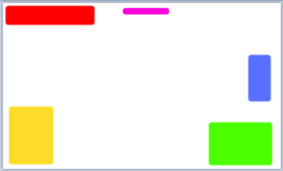
Yellow - Command Bar (or whatever name we come up for it)
Green - Health Bar/Magic Bar/Character Portrait/Any meter we decide to add
Red - Enemy Health Bar + Enemy Portrait(?) + Lock-On status (around the portrait if
using portrait, underneath the health bar if not)
Blue - Ally's Health Bar/Magic Bar/Character Portrait/Any meter we decide to add
Purple - Where the timer would go if any time-based fights occurred
I wanted to start with the position of the command menu since it's going to be the most used object on the HUD, so it would be best for it to be located in the "center" of the enemy's health bar and your health bar. My reason for this is that it should be easier on the eyes like this. The command menu requires the most focus (besides the actual gameplay of course), so any shift of attention away from the command menu should be as smooth as possible, meaning nothing on the HUD worth glancing at during a fight should be located diagonally from the command menu, where you would have to cross through any action at the center of the screen. There's usually no reason to be looking between your's and the enemies health bars too often, so it doesn't matter if they are diagonal to each other.
Having said that, maybe I should consider moving the timer to the bottom, but the timer seems like something that would only be used occasionally, and I like the timer at the top, so idk...
Anyways, any sort of comments are welcome.

 DDD The positions look great to me. The timer at the bottom would be too odd. I rarely look at the bottom of the screen during combat. (My peripheral vision is what I use to check my HP and I usually make shortcuts for my attacks/organize the command deck so I know what is coming next without looking)