
In a challenge of wits I won't be putting my money on young Sora.
You are using an out of date browser. It may not display this or other websites correctly.
You should upgrade or use an alternative browser.
You should upgrade or use an alternative browser.
Kingdom Hearts HD 2.8 Still On Track For 2016 Release in NA/Europe
- Thread starter Chaser
- Start date
|
REGISTER TO REMOVE ADS |
|
- Status
- Not open for further replies.
- Joined
- Jul 5, 2015
- Messages
- 4,520
- Awards
- 20
It's generally a bad idea to put your money on a 4-year-old for anything like that.In a challenge of wits I won't be putting my money on young Sora.
Maybe he's gotten smarten sinc......
- Joined
- Jul 5, 2015
- Messages
- 4,520
- Awards
- 20
*just got back from playing KHII*Maybe he's gotten smarten sinc......
yeah no
- Joined
- Jun 30, 2008
- Messages
- 12,681
- Awards
- 44
- Age
- 25
ya don't say
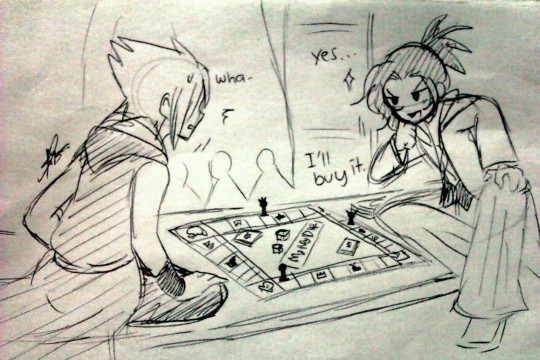
command board for 3 confirmed, all hail mickey monopoly.
*just got back from playing KHII*
yeah no
Maybe the biggest crime of the series is Sora missing out on his schoolwork. Makes you think.
- Joined
- Aug 8, 2013
- Messages
- 2,652
- Awards
- 11
he hasn't had dinner since he was 14. what has he been eating all this time
358 days of ice cream on the Other Side of his Stomach.
358 days of ice cream on the Other Side of his Stomach.
No wonder Sora is so hyper in KH2
- Joined
- Jul 5, 2015
- Messages
- 4,520
- Awards
- 20
The kid's saving the fantasy multiverse. I've seen people get out of schoolwork for lesser things.Maybe the biggest crime of the series is Sora missing out on his schoolwork. Makes you think.
I hate the models. Love the detail and style, but they look unfinished. Textures look incomplete or something about the lighting makes them look wrong. It has nothing to do with how realistic/unrealistic they look but they have that near-clay style I hated from KH3D's opening. It clashes with the environments.
If you guys don't see it, that's fine. We all have different tastes.
Looks like I'm not the only one who doesn't really like the new models. Good.
When I watched the openings of KH 1 & 2 I always wanted graphics like this, but now they look kinda....plastic? I don't know how to describe it. I need to see how it will be ingame, but the trailers look kinda wrong to me.
I like them but... yes, they look unfinished. Some of them look glazed and shiny, like jello. The 3D opening is my favorite (so far, followed by BbS/KH2), but the one scene that always rubbed me the wrong way is when Sora lands on DI and then he sees Kairi and Riku looking back smiling at him. Kairi is shaded strangely and her eyes are very dull. If they can spruce up the game to look like the DDD opening (except for some awkward shading sometimes), then I'd be satisfied. Even Sora's face still looks a bit awkward to me though they fixed it up a bit. Same for Mickey's face. They all just need... more detail? (In Sora's case, it's probably weird lighting or something)
An example of what I'm talking about is at about 1:45 in this video, where he compares what Yen Sid currently looks like, and touch up image by a fan
https://youtu.be/sDKVc391I4E?t=1m45s
If they tweak it justtttt a little, then I really have no complaints.
P.S: The plastic issue is not just for Kingdom Hearts either, I noticed this with other Unreal engine games to be honest
Yay for the responses above!
Personally I think that graphically, the DDD opening is the best the series has looked graphically. I have some problems with it as well (Sora's and Kairi's eyes look weird a lot of the time - like they are crazy) but the skin, the models and the lightning are insane.
.jpg)

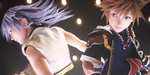


I mean - just look at the Riku picture! Compared to this, 0.2 is a huge aesthetic letdown.
An example of what I'm talking about is at about 1:45 in this video, where he compares what Yen Sid currently looks like, and touch up image by a fan
https://youtu.be/sDKVc391I4E?t=1m45s
It's amazing what a bit of added shadows can do to a model. Subtle, yet a big difference on his face.
- Joined
- Jul 5, 2015
- Messages
- 4,520
- Awards
- 20
^ And that was all achieved on a 3DS, a tiny lastgen handheld.
The irony. It's making my soul hurt.
The irony. It's making my soul hurt.
^ And that was all achieved on a 3DS, a tiny lastgen handheld.
The irony. It's making my soul hurt.
Well that was achieved on a high-end computer, put in a video file and put on the 3DS.

CGI isn't real-time graphics.
KH3 & 2.8 better have a N3DS port or I'm going to riot.
Hey guys I found a more interesting leak to talk about
- Joined
- Jul 5, 2015
- Messages
- 4,520
- Awards
- 20
^ kill it with fire or I'll do it myself.
^ kill it with fire or I'll do it myself.
T H E P I T S O F H E L LWHERE IS THAT THING FROM
- Joined
- Jul 5, 2015
- Messages
- 4,520
- Awards
- 20
I didn't realize you despised Disneyland that much.T H E P I T S O F H E L L
- Status
- Not open for further replies.