• Hello everybody! We have tons of new awards for the new year that can be requested through our Awards System thanks to Antifa Lockhart! Some are limited-time awards so go claim them before they are gone forever...

    CLICK HERE FOR AWARDS

I was bored today....


REGISTER TO REMOVE ADS
Status
Not open for further replies.

Xidon

Not highscoring in life
Joined
Oct 15, 2006
Messages
1,997
Age
32
Location
Why do you want that?
kaaay.png


Why is this here, I supposedly quit tagging :v


Eh, well CnC away peeps.
 

Zook

you can never leave KHI
Joined
Mar 30, 2005
Messages
4,228
Awards
4
that cloud like thing in the middle is nice but it doesn't fit in this tag.
 
D

Deleted member 36435

Guest
Beautiful except that cloud thing. Also, it looks like the right side has dirt on it.
 

Cloud

this guy are sick
Joined
Jul 27, 2004
Messages
6,650
Awards
6
Age
35
Location
England
I just don't think they compliment each other nicely. They all seem to clash and over power the stock.
 

Xidon

Not highscoring in life
Joined
Oct 15, 2006
Messages
1,997
Age
32
Location
Why do you want that?
Zook said:
that cloud like thing in the middle is nice but it doesn't fit in this tag.

Kubo said:
Beautiful except that cloud thing. Also, it looks like the right side has dirt on it.

I might expand or add similar effects to the tag later, so it won't look out of place for you two :9

Thanks for the comments fellas.

Scarecrow said:
still better than everyone else

<3

Vic said:
The colors are brilliant.

Thanks Vic :3


Eliwood said:
I disagree. The colour choice is horrible, it completely kills it.
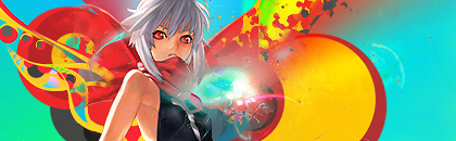
I wouldn't mind a comment on any other element of the tag, but in this case I strongly suggest you look up the color wheel.
 

Cloud

this guy are sick
Joined
Jul 27, 2004
Messages
6,650
Awards
6
Age
35
Location
England
Lol, i don't need to refer to anything, i know what i think looks good and doesn't. It's an opinion.

Edit: I suppose i'll post a more in-depth critique. The effects are nice, i really like them, there seems to be alot of effort and small detail in places. On the other hand, the faded effect on the right seems off, doesn't really blend nicely. The stock isn't good for me, but that's just personal preferance. I'd like to see some suttle effects in the background, maybe some sort of texture? I'd also like to see more done with the lighting, but it's not a major issue. Other than that, and my problems with the colours, it's good.

I didn't mean to come accross bitchy, but it's just what i think.
 
Last edited:

Xidon

Not highscoring in life
Joined
Oct 15, 2006
Messages
1,997
Age
32
Location
Why do you want that?
Lol, i don't need to refer to anything, i know what i think looks good and doesn't. It's an opinion.


Because it would be such a shame to look at some tag/art basics, right?

I don't mind opinions, however I asked for CnC, meaning critique and comment and you're missing the former of those two. If you have a negative remark about some aspect of the tag or the entire tag, I would very much appreciate it if you would care to explain your opinion rather then just say "I just don't like it cause I don't like it". Also I would like that opinion to have some basis.
 

Cloud

this guy are sick
Joined
Jul 27, 2004
Messages
6,650
Awards
6
Age
35
Location
England
Because it would be such a shame to look at some tag/art basics, right?

I don't mind opinions, however I asked for CnC, meaning critique and comment and you're missing the former of those two. If you have a negative remark about some aspect of the tag or the entire tag, I would very much appreciate it if you would care to explain your opinion rather then just say "I just don't like it cause I don't like it". Also I would like that opinion to have some basis.

I just don't think they compliment each other nicely. They all seem to clash and over power the stock.

Not quite "I just don't like it cause I don't like it."
 

Vicodin

relative power
Joined
Aug 5, 2005
Messages
2,345
Age
31
Location
Pennsylvania
basis basis basis basis

You can't change the color wheel by simply stating that the colors don't work.
They do work.
 

Cloud

this guy are sick
Joined
Jul 27, 2004
Messages
6,650
Awards
6
Age
35
Location
England
I'm expressing an opinion. I don't need a basis other than the fact that i don't like it.
 

Vicodin

relative power
Joined
Aug 5, 2005
Messages
2,345
Age
31
Location
Pennsylvania
But to be creditable, you do.

There are more than a shit ton of people who post in this section who don't understand jack shit about graphic design, or art for the matter, and what it entails. It's not just putting random things down onto a canvas. It's about understanding what is right and wrong.
Complementary colors will always work well together. It's a rule.

If you apply for a job, as, say, an accountant, but only have experience in, let's say, plumbing, you're not going to get the job because you don't have the /basis/ in the job you're applying for.
 
Status
Not open for further replies.
Back
Top