
You are using an out of date browser. It may not display this or other websites correctly.
You should upgrade or use an alternative browser.
You should upgrade or use an alternative browser.
Some Recent RXS Sigs
- Thread starter RoXS
- Start date
|
REGISTER TO REMOVE ADS |
|
- Status
- Not open for further replies.


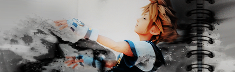


The first you killed the sig it seems, it is too distorted, and it looks LQ.
The second one is good, I would remove the red thing at the bottom though.
The third one, all I can say is that the eyes freak me out.
The last two are pretty much great, I don't see how they could get much better.
The second one is good, I would remove the red thing at the bottom though.
The third one, all I can say is that the eyes freak me out.
The last two are pretty much great, I don't see how they could get much better.
 you're pretty good.
- Joined
- Jan 27, 2008
- Messages
- 6,742
The first one is good, but the text needs to be bigger and with a better font.
The second is also good, Nice effects on the right but like the first the text needs to be bigger but the font used is alright. And remove the red color on her. Looks out of place compared to the rest of the colors.
The third has some nice effects going on but the black and white colors don't really catch the eye.
The fourth is the best one of the bunch in my opinion. If you could do something about the few empty parts it would look very awesome. Nice contrast and all.
Fifth is okay. I think it would look better if you spread the effects on the whole canvas.
- Joined
- Mar 18, 2007
- Messages
- 3,591
- Awards
- 1
- Age
- 30
Don't know why, but I really like the first one, just remove that text.
Thanks everyone :]
And @Tight Like Amy:
I'm not exactly new, I was here a while back I just decided to come back :3
oh, well then.
welcome back.
C
Charlie
Guest
1st 2 are sick, peter.
glad i decided to bring you to my hen house.
But you've gotta learn to sharpen your shit up.
Then, you need a larger variety of fonts.
And you need a bit more strength to your composition.
gradients x levels.
glad i decided to bring you to my hen house.
But you've gotta learn to sharpen your shit up.
Then, you need a larger variety of fonts.
And you need a bit more strength to your composition.
gradients x levels.
- Status
- Not open for further replies.