• Hello everybody! We have tons of new awards for the new year that can be requested through our Awards System thanks to Antifa Lockhart! Some are limited-time awards so go claim them before they are gone forever...

    CLICK HERE FOR AWARDS

Pentooled: Lightning Farron


REGISTER TO REMOVE ADS
Status
Not open for further replies.

Key

Exile
Joined
Nov 27, 2009
Messages
1,199
Awards
1
Location
a blank space where ideas flourish
WARNING huge image.

ok, we had a project at school where we had to vector out a person using illustrator. some people wanted to do videogame characters and our teacher said it was ok as long as they were super-realistic. so i did, and i picked Lightning.

I would appreciate some C&C... some detail i missed, something that could be fixed, etc. :D
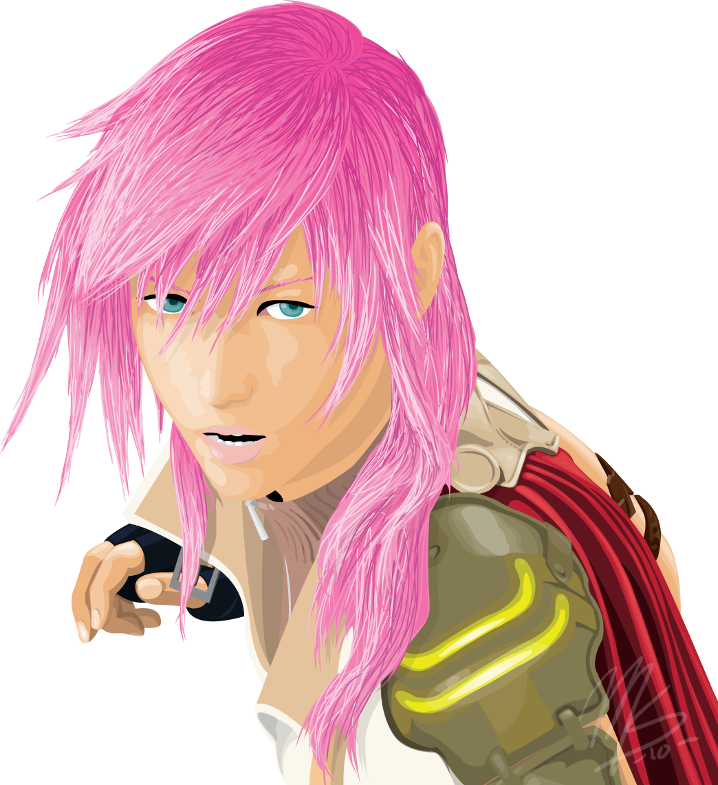

Lightning_by_The_Hybrid_Mobian.png
 

Tenyas

RE: +"T!red"+
Joined
Aug 10, 2009
Messages
8,398
Location
gallivanting about
That is really beautiful. <3 For the style you used, the colors and shading work really nicely. I only have qualms with the lips being super-pale against the skin.

The only thing I can think of you missing is maybe some eyelashes below the eye, people do have some there.
 

Subtly Inspiring
Joined
Aug 29, 2005
Messages
1,746
not bad at all.
but the hair leaves a lot to be desired. try working with gradients to make the hair flow a bit bitter, instead of solid strands. the general eye area could use a lot of work, with eyelashes being a bit more defined and a more obvious eyelid around the white.
shoulder pad and cape are pretty noice tho, same for the hand
 

tangerine

Member
Joined
Jul 16, 2008
Messages
840
Awards
4
Age
116
Location
Second City
LINES. You forgot your lines. They're extremely important in order to define sections and depth. They don't have to be black, but they have to be evident. (They can even be different colours depending on the section that's outlined.) Don't make the lines a single width all around, though. Make them thicker and thinner where it's needed to compliment the depth of a particular feature.

I like the style of the hair, although you could've chosen better colours. The white is way too contrasting. Just use a lighter pink if you want to keep pink tones.

The shading is pretty inconsistent, such as on the neck, the buckles and everything other than the hair. The facial elements other than the nose are poorly executed; the lining and the shading is off. It's especially true for the eyes, which are suddenly flat. The teeth look pretty bad, as well, because of that random white block on the left. The ear appears to just be sliced in. (The hair around doesn't take note of the angles behind the ear. This makes it look as though the ear is just a flat flap of flesh that's hanging out.)

The main problem with this vectored piece is that it's inconsistent all over. The hair is meticulously done while the rest leaves some to be desired and in some places the shading is lost completely and so are the details. Try to be consistent with the details! Things don't blend together properly if they're done at different levels. Don't forget your lines. They take a long time to do but they add so much more to a piece.
 

Key

Exile
Joined
Nov 27, 2009
Messages
1,199
Awards
1
Location
a blank space where ideas flourish
That is really beautiful. <3 For the style you used, the colors and shading work really nicely. I only have qualms with the lips being super-pale against the skin.

The only thing I can think of you missing is maybe some eyelashes below the eye, people do have some there.

Yeah, i realized that after turning it in. XD i'm probably going to touch up those areas later.


♥;5063230 said:
not bad at all.
but the hair leaves a lot to be desired. try working with gradients to make the hair flow a bit bitter, instead of solid strands. the general eye area could use a lot of work, with eyelashes being a bit more defined and a more obvious eyelid around the white.
shoulder pad and cape are pretty noice tho, same for the hand

Alright, i'll try to fix it. thanks. :D

LINES. You forgot your lines. They're extremely important in order to define sections and depth. They don't have to be black, but they have to be evident. (They can even be different colours depending on the section that's outlined.) Don't make the lines a single width all around, though. Make them thicker and thinner where it's needed to compliment the depth of a particular feature.

Uhh, the point of vectoring is to NOT have lines. that's the style i was going for.

I like the style of the hair, although you could've chosen better colours. The white is way too contrasting. Just use a lighter pink if you want to keep pink tones.

The hair IS lighter pink, not white. well, it is on my monitor anyway :/

The shading is pretty inconsistent, such as on the neck, the buckles and everything other than the hair. The facial elements other than the nose are poorly executed; the lining and the shading is off. It's especially true for the eyes, which are suddenly flat. The teeth look pretty bad, as well, because of that random white block on the left. The ear appears to just be sliced in. (The hair around doesn't take note of the angles behind the ear. This makes it look as though the ear is just a flat flap of flesh that's hanging out.)

I will admit, the shading is a little bit rushed, and switching illustrator versions from CS4 to CS3 midway through the project honestly didn't help. I didn't get to do much with the eyes due to time constraints, and apparently when saving it as a PNG the shading i DID to on the eyes turned out too light. I see what you mean about the teeth, i need to fix that. I also see what you mean about the ear, but again, due to time constraints on the project, i was unable to deal with it.

The main problem with this vectored piece is that it's inconsistent all over. The hair is meticulously done while the rest leaves some to be desired and in some places the shading is lost completely and so are the details. Try to be consistent with the details! Things don't blend together properly if they're done at different levels. Don't forget your lines. They take a long time to do but they add so much more to a piece.

The shading didn't turn out as i had planned, i'll say that much. The lighter shades kept blending together, and i never figured out a way to fix it, but i guess i'll have to work on that. Again, the point of the piece was NOT to use lines, so i can't do much about that. ^^;


Thanks for the comments, you guys~ :D
 

tangerine

Member
Joined
Jul 16, 2008
Messages
840
Awards
4
Age
116
Location
Second City
Uhh, the point of vectoring is to NOT have lines. that's the style i was going for.

Again, the point of the piece was NOT to use lines, so i can't do much about that. ^^;

That's not the point of vectoring. :s You originally stated that you were going for a realistic style. It's much harder to make something look realistic without lines as they add depth to a graphic, and this piece definitely doesn't look very realistic. Click here to see an example of a good realistic vector. It has lines absolutely everywhere without taking away from the graphic or standing out so much that they're distracting. However, the lines here distinctly separate one object from another. As I stated earlier: lines don't have to be black, but they have to be there because they finalise a shape and define it from the next one. Look at the hand in that vector where the lining is obvious, for example--if that lining wasn't there, the hand would blend together with the chest and that area would look flat. However, with that line there, it's much easier to note that the hand is an object placed over rest of the graphic.

Point: if you're going for realistic, then use lines. Lines are so good at defining depth that you can actually achieve good depth without any shading, just using lines.

The hair IS lighter pink, not white. well, it is on my monitor anyway :/

Hmm, it might be a lighter pink (it's very bright and looks white on my screen), but it's definitely a lot lighter than the next shade of pink used. The pinks used before that get lighter very gradually, so it would appear nicer if the lightest shade wasn't extremely brighter.

Anyway, it's a good early step to vectoring and I can see that future works of yours have potential. :}
 

Key

Exile
Joined
Nov 27, 2009
Messages
1,199
Awards
1
Location
a blank space where ideas flourish
That's not the point of vectoring. :s You originally stated that you were going for a realistic style. It's much harder to make something look realistic without lines as they add depth to a graphic, and this piece definitely doesn't look very realistic. Click here to see an example of a good realistic vector. It has lines absolutely everywhere without taking away from the graphic or standing out so much that they're distracting. However, the lines here distinctly separate one object from another. As I stated earlier: lines don't have to be black, but they have to be there because they finalise a shape and define it from the next one. Look at the hand in that vector where the lining is obvious, for example--if that lining wasn't there, the hand would blend together with the chest and that area would look flat. However, with that line there, it's much easier to note that the hand is an object placed over rest of the graphic.

Point: if you're going for realistic, then use lines. Lines are so good at defining depth that you can actually achieve good depth without any shading, just using lines.

AH, i see what you mean now. i'll give it shot with my next piece. :)


Hmm, it might be a lighter pink (it's very bright and looks white on my screen), but it's definitely a lot lighter than the next shade of pink used. The pinks used before that get lighter very gradually, so it would appear nicer if the lightest shade wasn't extremely brighter.

Anyway, it's a good early step to vectoring and I can see that future works of yours have potential. :}

Ah, okay! Thank you very much for your tips. ^^
 
Status
Not open for further replies.
Back
Top