• Hello everybody! We have tons of new awards for the new year that can be requested through our Awards System thanks to Antifa Lockhart! Some are limited-time awards so go claim them before they are gone forever...

    CLICK HERE FOR AWARDS

Favourite KH Box Art?


REGISTER TO REMOVE ADS
Status
Not open for further replies.

Cactuar

New member
Joined
Jun 2, 2016
Messages
61
Location
Canada
So the KH series has had a lot of games and of course a lot of box arts, but which ones are your favourite, least favourite, which aspects do you like of them, etc?

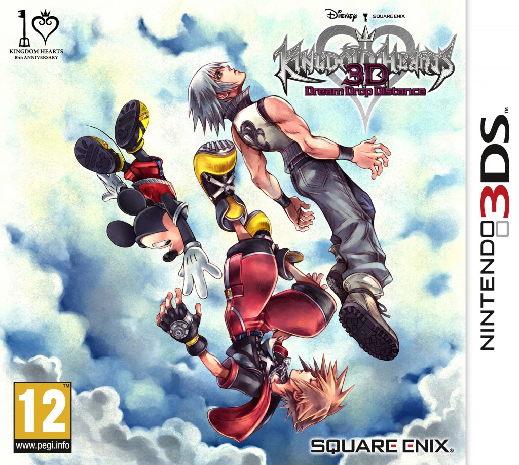
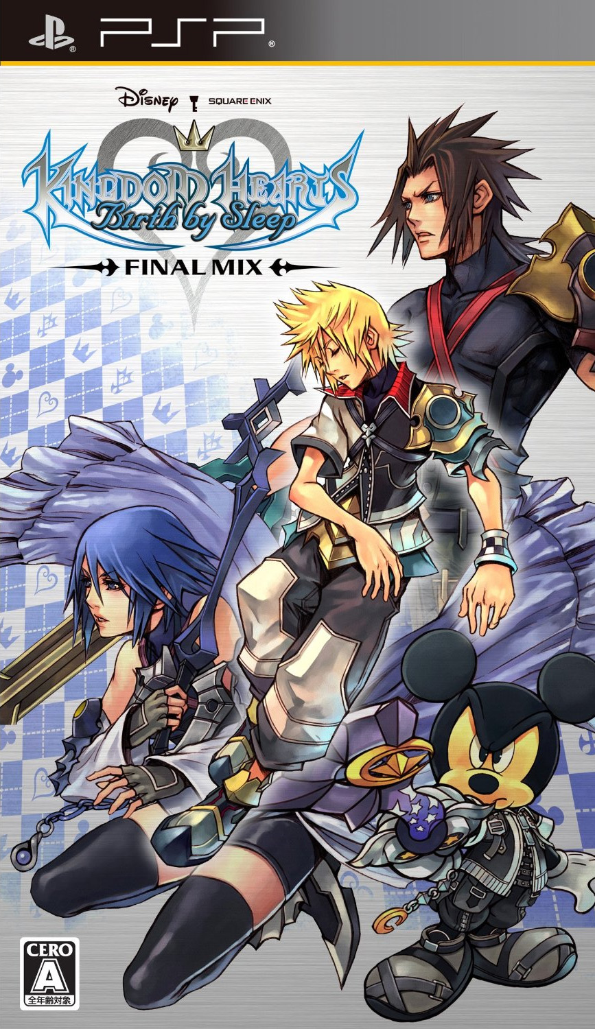
Easiest one to start with is my least favourite which is the original BbS one. I've just always found this one so meh and even though DDD's is kind of similar at least there's some meaning behind it. The BbS one is just all around boring tbh.

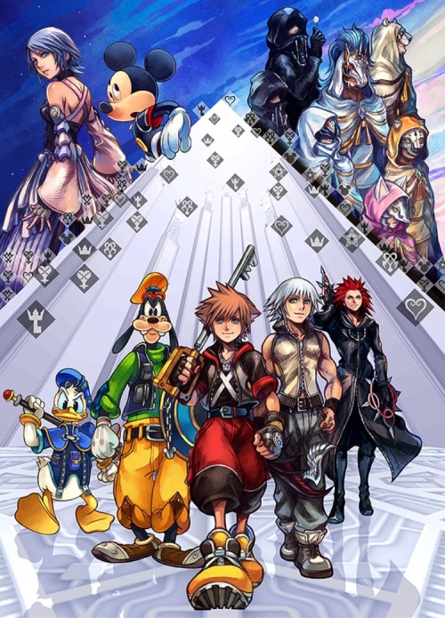
It's difficult to pick a favourite just cause they all just have such a special place in my heart. I've always loved the original KH one though just cause it's so much "darker" than all of the other ones. On one hand it's interesting that they went in this direction for the first game as you'd almost expect it to be colourful to be like "hey look there's Disney in this too!" but I guess they wanted to show that the game did have some darker themes and wasn't going to be happy-go-lucky the whole time.

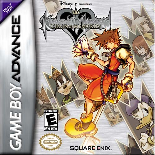
I've always thought the original CoM art is super cool. Sora just looks so damn fly in it. The Re:Coded one is great too cause everyone just looks so frickin adorable ~~~

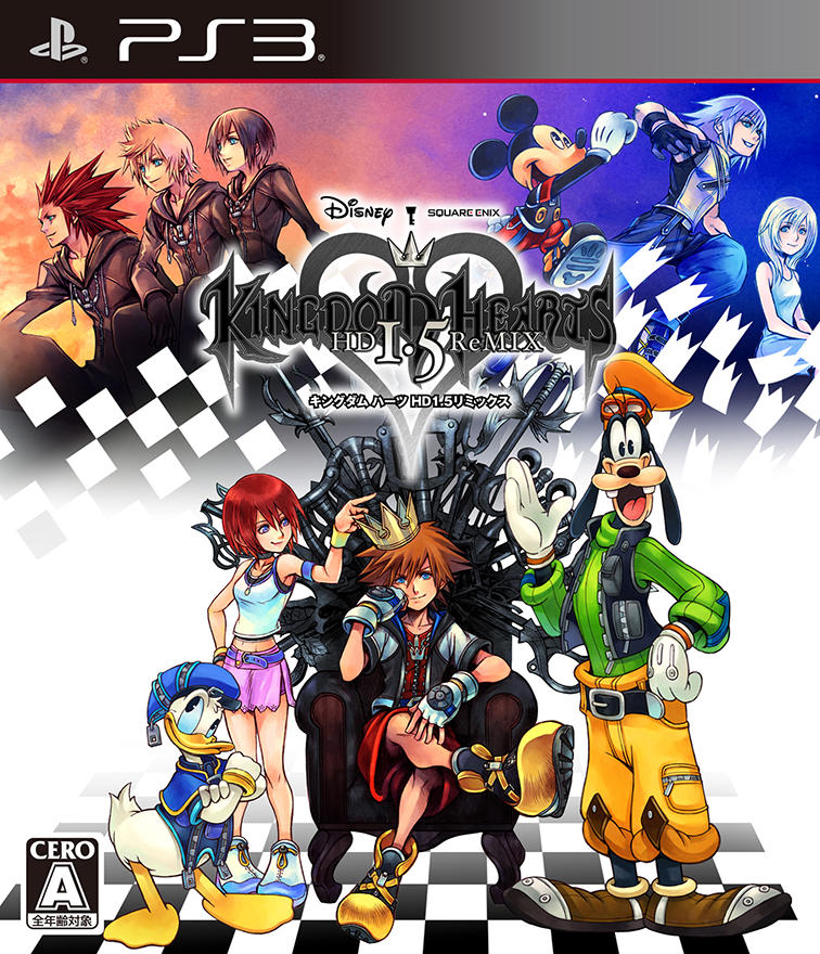
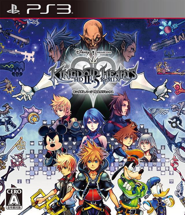
Of the HD Remixes I think 2.8 has to be my favourite. The art is just so pretty and the pinks and blue really go well together. 1.5 is great for Sora in his Game of Thrones-esque chair. 2.5 is really nice too but they could have done without all of the keyblades going along the border cause it just makes it way too busy imo.


Spoiler Spoiler Show


Spoiler Spoiler Show


Spoiler Spoiler Show


Spoiler Spoiler Show
 

Cactuar

New member
Joined
Jun 2, 2016
Messages
61
Location
Canada
Couldn't fit all in one post cause of image limit, so here are the rest for ease of reference:

Spoiler Spoiler Show


Spoiler Spoiler Show
 

Grizzly

Stopza
Joined
Aug 25, 2014
Messages
1,527
Awards
33
Location
United States
KH2 is nostalgic to me, although DDD is probably the best designed in my opinion.

Most of the covers are way too busy or outlandish if you ask me. Sure, they're iconic for the series, but I think simpler designs are much more eye catching.
 

Recon

Art of War
Joined
Jul 22, 2009
Messages
5,497
Awards
18
KH1 boxart is just so iconic with everyone looking forward and with Riku with his back turned.

KH1 Remix sort of goes for the same expression. Everyone one is looking in different directions (left, right, up down) and then has Sora positioned looking at you. It's a more serious tone, but meaningful.
 

VoidGear.

red gay
Joined
Jun 6, 2015
Messages
5,594
Awards
57
Age
29
Location
Germany
I reaaaally like the KH1FM cover a damn lot. I'm quite okay with most of them though.
 

Muke

whatever
Joined
Nov 30, 2014
Messages
6,113
Awards
39
Location
Vienna
KH2, simply because I love the art and 'cause it's so nostalgic.
 

Ueki_168

New member
Joined
Apr 4, 2017
Messages
46
Age
27
Location
Anywhere but where I want to be
So, I'd say my list goes like this, and I'm gonna leave the ReMixes out:

1- KH 1FM. It's beautifully illustrated and I love to stare at it. Plus, I had it as my background for my first smartphone.

2- KH BBS (PAL). The slim case and the silver background color of the cover makes it really cool to look at. I really like it because of the design and the box, cuz I like PSP boxes way too much.

3- KH CoM. Call me a box fanatist, but the illustration and the colors chosen for the boxart captivate me. I own a copy of the original box and I love to look at it.

4- KH ReCoM. It's a good transition from square to rectangle. It loses the message of "hey, this game is about cards, look, there's cards everywhere", which is a bit of a downgrade, but I love the art style.

5- KH 358/2 Days. I do not own this one, but I absolutely love the illustration and the lack of forced Disney on it. I like it a lot but not too much.

6- KH 1. This boxart is really special, and it may be a bit of bias, but I don't feel fond of the deeply dark colors they used. I absolutely love my copy of the game, but the picture got deteriorated. A different color pallet would up this on the list.

7- KH II. So, this box is beautiful, I love the silver background and all, but I dislike the illustration. To me, it lacks charisma. But I give it a plus for having Roxas in it <3.

8- KH IIFM+. I don't have much to say about this one, I... like it? I just accept it.

9- KH BBSFM. This one. I see it as a nice attempt, but it not well put. Things cut off by the borders, images slapped one on top of the other. I don't like the chaos.

10- KH 3D. I'm sorry but even if the art is amazing, and it perfectly conveys the message of the game, I don't like it too much. I think they could've gone for a more colorful approach, so much white gives me a sense of laziness.

11- KH ReCoded. Pretty, but too simplistic in design. I just don't like it *shrugs*
 

Alpha Baymax

On a scale of α to ζ.
Joined
Sep 5, 2015
Messages
4,782
Awards
23
Age
28
Location
United Kingdom
i know which one is the worsssst at least

BBSFM. god.

To add insult to injury, that's the art used for the 1.5+2.5 menu selection screen. The original Birth by Sleep art had such style, why change what was already working?!
 

The Dark Mamba

Active member
Joined
Mar 22, 2013
Messages
599
Awards
3
Location
Corona California
To add insult to injury, that's the art used for the 1.5+2.5 menu selection screen. The original Birth by Sleep art had such style, why change what was already working?!

I really hate that they did that. All of the remixes utilized the original cover art expect BBS which used that awful FM cover.

Seriously, that BBS FM cover is the near equivalent of that Spider-man Homecoming poster. (Near equivalent.)

Spider-Man_Homecoming_poster.jpg
51bRy96QFcL.jpg


Wow. They're pretty damn similar.
 

VoidGear.

red gay
Joined
Jun 6, 2015
Messages
5,594
Awards
57
Age
29
Location
Germany
I actually don't mind the BBS FM cover much. It kinda doesn't make any sense, but neither doesn't the original one, and the FM version has pretteh Aqua face so that's good enough to me.
 

Zettaflare

Shibuya
Joined
Jan 2, 2013
Messages
11,819
Awards
5
Location
California
KH1 box art is my favorite as well. Seeing two classic Disney mascots with FF anime like characters for the first time was so jarring yet memorable when I was ten.

Though something that always confused me was what exact world where they in? Traverse Town?
 

Caxinuld

Member
Joined
Sep 11, 2016
Messages
322
Awards
3
It's like the artist who created the BBSFM artwork took inspiration from the Style-B Star Wars posters & tried to make some KH artwork, but it ended up being looking cramped as hell.
 

Cactuar

New member
Joined
Jun 2, 2016
Messages
61
Location
Canada
I really hate that they did that. All of the remixes utilized the original cover art expect BBS which used that awful FM cover.

Seriously, that BBS FM cover is the near equivalent of that Spider-man Homecoming poster. (Near equivalent.)

Spider-Man_Homecoming_poster.jpg
51bRy96QFcL.jpg


Wow. They're pretty damn similar.

Oh god this comparison is super on point. It's just the individual character arts placed on top of one another.

The BbS FM art is not great, but the Spiderman one is seriously just utter trash imo
 

FudgemintGuardian

Moist with roistering
Joined
Jan 16, 2012
Messages
6,316
Awards
39
The first game still has one of the coolest video game box arts ever. Everyone looking at the night sky except Riku, in the opposite direction with his eye's closed, head down. I love subtle symbolism. The Final Mix art is very good (Donald is so adorable in it!) but for me it doesn't look right as box art. great key art, but not box art.

Since the original CoM was my first KH game, I have a soft spot for it's shiny box art. The Re;CoM art is nice. I love Sora and Riku in it but the rest is meh.

KH2's cover kinda bores me. Everyone is just sitting there all looking in different direction. It's like it was trying to copy the first game's box art but lost the meaning and feel behind it. The Final Mix cover basically does the same thing but better. My only real issue being the Sora and Riku from the Re:Com art superimposed in the sky. I know it's because Re:Com originally came with KH2 Final Mix, but it looks weird.


358/2 Days is okay. Nothing really for or against it besides Mickey being prominently on the cover despite having two seconds of screentime. What's funny is that he even looks like he was meant to more in the background given his faded color.

With BBS' first box art, it's simple and just...okay. The Final Mix art is horrible and should be killed with fire.

Re: Coded is fine. Bonus points for having Jiminy, Chip and Dale on the cover.

I love DDD's box art. The art style is very pretty and it's got that good ol' symbolism.
Spoiler Spoiler Show


1.5 ReMIX is very nice. Simple despite having to fit three games on one cover. 2.5 decides to do the opposite of simple and crams floating heads everywhere. The Keyblades do not help at all. KH box art needs beautiful empty space.

2.8 is super poster worthy. Placement is similar to 1.5. Major asymmetry thanks to the Foretellers but doesn't look too awkward.
 

Elysium

Be Wiser Than the Serpent
Joined
Nov 4, 2012
Messages
3,772
Awards
37
1. KH1
2. Re:CoM
3. 2.5
4. KH2
5. CoM
6. 2.8
7. 3D
8. KH1 FM
9. Days
10. KH2 FM
11. BbS
12. 1.5
13. Coded
14. BbS FM

I love the first six on this list. The KH1 cover is so iconic. I always loved the CoM cover, too, with all the cards. The Re:CoM cover is even better, imo. I love the poses they gave Riku and Sora. (I wish the original CoM cover had incorporated Riku’s pose for RRebirth.) The KH2 FM cover is a bit odd to me. They look like pencil tops.
 
Status
Not open for further replies.
Back
Top