You are using an out of date browser. It may not display this or other websites correctly.
You should upgrade or use an alternative browser.
You should upgrade or use an alternative browser.
durp.
- Thread starter Davey
- Start date
|
REGISTER TO REMOVE ADS |
|
- Status
- Not open for further replies.
Crit timeee
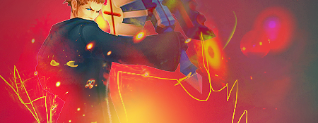
tag 1: Love the colors used and the pen-tooling is a nice touch, however, the red orbs in the top right seem unnecessary, unless you add something else, or move it a little closer to the stock. Also I noticed on the left side of the stock (I really don't remember this guy's name lol) there's a bit of an outline still visible. Dk if you noticed that or not.
tag 2: Again, I like the colors, and here the use of depth is visible. I actually like this size tag better than the first. My only issue with it is that xaldin's face isn't too clear. Also text would be a good addition in both tags, probably in the background.
- Joined
- Mar 27, 2005
- Messages
- 8,780
- Awards
- 3
more likeWHY U NO WAN POST SUM CRIT KHI GFX TEAM?!?!?!

"DM"
"Y U NO POST CRITIQUE???"
- Joined
- Feb 27, 2006
- Messages
- 1,033
- Age
- 32
there's a bit of an outline still visible. Dk if you noticed that or not.
I did. I did these at like 4 am and I was super tired and didn't feel like pen tooling a stock or fixing anything, just went for it, haha. But thanks.
Well, when you said 4am, I cut you a break like, RIGHT THERE.
Just wanna go so far as to say their both pretty incomplete and you saw more success with the first tag. Second's smudge trails aren't that appealing, and the random C4Ds in both aren't cohesively blended in.
Just wanna go so far as to say their both pretty incomplete and you saw more success with the first tag. Second's smudge trails aren't that appealing, and the random C4Ds in both aren't cohesively blended in.
- Status
- Not open for further replies.


