• Hello everybody! We have tons of new awards for the new year that can be requested through our Awards System thanks to Antifa Lockhart! Some are limited-time awards so go claim them before they are gone forever...

    CLICK HERE FOR AWARDS

[3D] Sora 2008


REGISTER TO REMOVE ADS
Status
Not open for further replies.

mogcaiz

New member
Joined
Jan 21, 2007
Messages
108
Location
Norway
Website
mogcaiz.deviantart.com
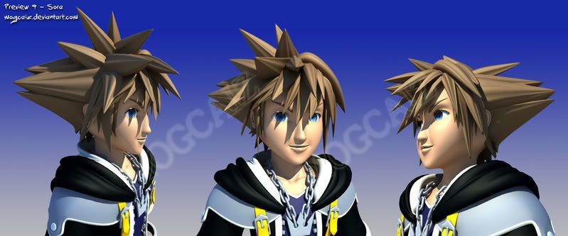
Hummmm.. Yeah Both me and Sora is still alive, despite its like a year since I let anyone hear about the progression of my Sora 3D model >.< Sorry for the long wait, but I felt I needed this year to expand my both technical, software related skills, and the artistic eye for what looks good, and what does not.

Some might remember the old wip thread from 2007, where I created a horrible 3D Sora with a face like a expanded plastic balloon. Well Ive the last evenings tried to fix that, so he is less horrible with a less bubbly cheeky face.I've also put my mind into trying to recreate the same visual style as you see in the KH CG film sequences. I think I've improved, but still got a way to go.

Could call it a second version of Sora, but its still not finished until I'm satisfied.
kh_sun_shade4.jpg

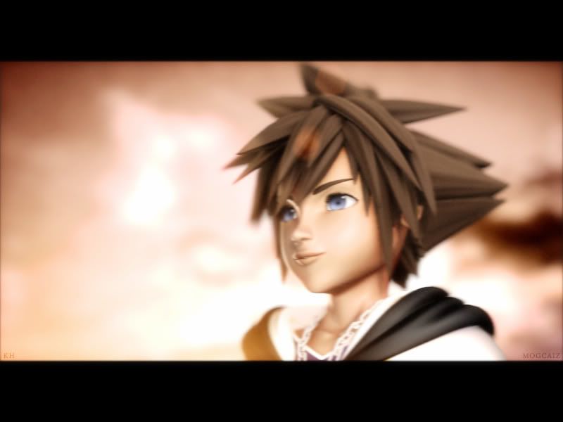
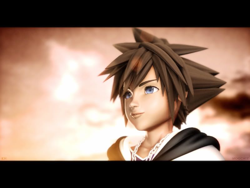
If you liked it, please see my dA account where I host my most recent art :) KH - Shading Sunset by *mogcaiz on deviantART
(...and also because I can keep track of the pageviews :3 )

Comments and feedback about what could be improved is welcome. BUT keep that "Anime is not serious art; here google human faces and anatomy instead!!" -bullshit out of this thread. It sounds like there have been an large scale epidemic of anti-anime virus which I just missed.
 

Subtly Inspiring
Joined
Aug 29, 2005
Messages
1,746
"Anime is not serious art; here google human faces and anatomy instead!!"


On a more serious note, the colors don't reflect a sunset too well. Even during a sunset you'd have contrasted oranges and reds, not washed out unsaturated pinks and browns.
and depending on which way the sun is setting, the sky would still be blue in some areas.
that said, it's blurry and noisy.
 

Spic Steve

LOLOLOLOLOLOLOLOLOLOLOLOL OLOLOLOLOL
Joined
May 13, 2006
Messages
3,306
Awards
3
Age
29
His lips look a little strange. Looks like a fish. I kinda don't like the background either. Despite that, I like it
 

mogcaiz

New member
Joined
Jan 21, 2007
Messages
108
Location
Norway
Website
mogcaiz.deviantart.com
Ray:
I started out using very high contrast of orange tones. Because, as you said, its more natural, however I felt it simply didnt look good and not very KH alike. Note that its the CG movies from the game Im trying to copy, not a RL world sky and sun system.

The blurry and noisy thing you dont like, effects and filters, as I would call it, is intentional.
When watching a CG movie or a game trailer, whatever, Try hitting your pause button and look for yourself. It IS blurry: Mainly two different types of blurs occur: Focus blur, depending on your camera settings and focal point, you will see a focus blur appear, aka depth blur. The second blur is simply motion blur. Im not going to explain what it is, but try hitting the pause button again anytime in a CG film and see for yourself.

Noise, or film grain is also intentionally applied to. When used correctly, it can look good, and create the illusion of that the CG is more realistic, and actually being filmed by a camera, and not rendered. The grain is barely visible, but its there. Or what kind of noise did you talk about?

When that said, its all just small tricks from the book to try to lift up the overall look of CG.
I tried orange sky, and didn't like it. I added grain and motion blur, and liked it. I'm sorry you did not like it, anyways assuming you're a part of the audience, I guess I will have opinion in consideration in my quest for improvement.
 

mogcaiz

New member
Joined
Jan 21, 2007
Messages
108
Location
Norway
Website
mogcaiz.deviantart.com
His lips look a little strange. Looks like a fish. I kinda don't like the background either. Despite that, I like it

The mouth was harder to match than I thought, but I know what you mean, and I've noted it down. Ty. The background? Can I ask for a clarification? I would like to know this.
 

Ashley

| P |
Joined
May 18, 2006
Messages
259
Age
34
Website
ashley425.deviantart.com
Ah yes, I remember this project! Comparing this from your old version, I'd say it's a great improvement. I can see how you fixed the cheeks, and it looks great! I also saw the rotating model on DA and the clothes and body look great! The only part that still bothers me a bit is the face. Like Toasty mentioned, the lips look a bit puffed. Could you try making them smoother or flatter? (sorry for my wording, I don't know how 3D works) ^^;

But it truly is eye candy to see 3D works like this. I'd love to see more! Great work man!
 

Spic Steve

LOLOLOLOLOLOLOLOLOLOLOLOL OLOLOLOLOL
Joined
May 13, 2006
Messages
3,306
Awards
3
Age
29
The background just doesn't mix with Sora. It's too gloomy but it looks like you were trying to make it look brighter. I think it might be the blur effect.

Oh and by the way, this your old wip?

preview09_mogcaiz.jpg


Great improvement.
 

Mason Stark

TICK TOCK, KID!
Joined
May 12, 2004
Messages
7,091
Awards
18
Location
Gravity Falls, OR
Website
twitter.com
Yay! This project is back! :D I love the Sora model you created and I definitely agree: this is a great improvement. His face looks much better and more like Sora, but the lips look fish-like. The background doesn't look that weird, though; probably just the whole blur thing. It makes me think of Twilight Town, which is neat too. That's the only strange thing about it, though. xD; It looks great otherwise! Definitely can't wait to see more! :]
 

mogcaiz

New member
Joined
Jan 21, 2007
Messages
108
Location
Norway
Website
mogcaiz.deviantart.com
Ashley425: You do? ^^ Thank you! His face is just damn hard to match up to be identical from all angles xD But It seems like the majority agrees the lips are to fishy, like he is pouting or something is correct, I'll look into it ^^

Toasty!: Heh yeah, please shelter me from those old renders ^^; Its embarrassing to see them to be honest xD.
Hmm.. more complaint about the background? I I guess my next render must feature another theme and background then xD Cool. Cant wait to try that out! x3

Takushi Rena: Thank you :) I think so too.
Btw, I like your siggy and the picture of him there. Going to use it as reference to tweak his lips out xD

Thanks for the feedback so far. Im fully aware of that his lips are fisy, and the background somehow sucks by now :p
*goes back to work*
 

Spic Steve

LOLOLOLOLOLOLOLOLOLOLOLOL OLOLOLOLOL
Joined
May 13, 2006
Messages
3,306
Awards
3
Age
29
yeah, he looks like jay leno, lmao. I love your work though, from what I've seen. Especially the Roxas render. Show me when you complete it.
 

mogcaiz

New member
Joined
Jan 21, 2007
Messages
108
Location
Norway
Website
mogcaiz.deviantart.com
lol! Oh no! I forgot I had a roxas to complete >.<; I did make a thread about it here, didnt I? When I wrote 2008 in the Thread topic, I felt a certain resemblence xD
Uhm.. So yeah. I will try to focus to finish sora first, since he is before Roxas .

So any ideao of what kind of background would suit Sora more, rather than this pinky sky?
 
Joined
Mar 29, 2007
Messages
3,118
Location
where all surrounding chaos stands still
hmm the pic seems a little blurry...and the lips I agree look a little wierd.

as for the background, the colors blend in with Sora too much...

you'd want something that doesn't blend, yet would look nice. I'd try maybe a sky blue? (no flaming on suggestion! lol)

I think it is coming along great, though! and I'm really excited to see how your other work will come out (Roxas). =D
 

Antiquity

Put on your courage and fly
Joined
Sep 1, 2007
Messages
3,512
Awards
5
Location
In a cereal box
Your hard work pretty much paid off.
IMO the face looks a little feminish, but it's still good!
Nice improvement.
 

Danica Syer

Trivia: Love ღ
Joined
Apr 7, 2005
Messages
3,879
Location
Misthallery
I love your Sora model although the lips, I think need improvement but otherwise, nothing else from what I can see!
 

mogcaiz

New member
Joined
Jan 21, 2007
Messages
108
Location
Norway
Website
mogcaiz.deviantart.com
I've recieved more and more complaints about the blurryness in the pic xD. So I did a new render of it without the blur. Screw the blur, I actually thought it looked just as good without it.

I've taken the fishy lips, girly face, and gloomy unsuiting background into account, I'll change that in my next render, which will hopefully be better than this one.
In meanwhile, I hope you like the less blurry version!
kh_sun_shade5.jpg


...and I hope it wont take a whole year till my next render like the last time >.<
Ty ty, for the comments and critiques. You guys are hard to deal with, got so damn high standards, lol, but its all for the better good in the end ^^
 
Status
Not open for further replies.
Back
Top