• Hello everybody! We have tons of new awards for the new year that can be requested through our Awards System thanks to Antifa Lockhart! Some are limited-time awards so go claim them before they are gone forever...

    CLICK HERE FOR AWARDS

I fly like paper, get high like planes


REGISTER TO REMOVE ADS
Status
Not open for further replies.

Veritas

Is Retired.
Joined
May 6, 2006
Messages
1,989
Age
33
Location
Denver, CO
Website
www.myspace.com
flyhightag.png


CnC.
 

Vayne Mechanics

Expert of Asian things
Joined
Mar 27, 2005
Messages
8,780
Awards
3
I don't think you should have blurred the closer wing due to the fact that the text and foreground spheres aren't blurry. Therefore it creates an awkward and skewed DoF. Otherwise, I like it.
 

Veritas

Is Retired.
Joined
May 6, 2006
Messages
1,989
Age
33
Location
Denver, CO
Website
www.myspace.com
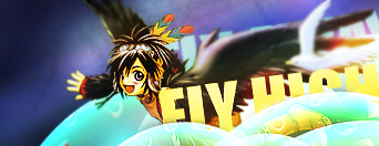
I didn't blur the wing It was like it on the stock I used. The only really editing to the stock I made was sharpening the face a bit more. Otherwise, it's basically the same. Blurred text and foreground looked even more awkward, and taking out the text would've left the right empty feeling. Also, the face wouldn't be blurred if the depth was consistent. The foreground would've been since the wing is farther foreward than the face, and the face is the focal point.

Thanks though, Darky.
 
Last edited:

Subtly Inspiring
Joined
Aug 29, 2005
Messages
1,746
the main problem is the fontface and font color of choice.

Pale butter yellow? Come on.
No.
 
Status
Not open for further replies.
Back
Top