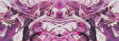
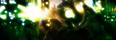
Both are creative in their own ways, but are engulfed in effects to keep them from being really appealing.
*Add more negative space to the first, so it doesn't look so strangled by the stock sizes. Then, add some color variation with that pink - purple there. It looks dry and monotone, color wise at the mo' :3 Mix it up.
*Sharpen the stock by a bit, and lower the opacity on some of that blurring/lighting all over the place, but keep its intensity.