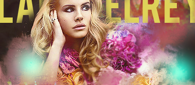
I've seen some good work from you in the past, but I honestly don't like this one. It comes off as a punch of colors smudged into rigid splotches that don't really add anything. The stock is great and yeah you don't want to detract from that, but there's not even, say, a devolution from the stock/flowers. It's just kind of some different colored splotches around the stock with some light blue soft-edge circles set to screen. It appears you're trying to complement the colors of the stock/flowers, but honestly it's not working.
I can kind of see what you were trying to do, but it comes off as random and does not mesh well at all. Then your abrupt contrast at the top makes it look okay if you don't focus anywhere on the tag in particular, but as soon as you do, it just kind of clashes against the flow. I'm not a fan of the text, but it's not my biggest gripe wither.
I think if there was more time put into the smudging/areas around the stock, it could have come out as much better. This all comes off as a random assortment of effects, and not the good kind.