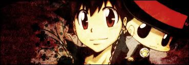
• Hello everybody! We have tons of new awards for the new year that can be requested through our Awards System thanks to Antifa Lockhart! Some are limited-time awards so go claim them before they are gone forever...

    CLICK HERE FOR AWARDS

I slipped and got myself a frog in the mouth.


REGISTER TO REMOVE ADS
Status
Not open for further replies.

Rae

AYY FUTURE FISH
Joined
Mar 8, 2006
Messages
851
Age
29
Location
Deep in the hundred acre wood where Christopher Ro
Website
kurotofu.tumblr.com
1
x1.jpg


2
x2.jpg

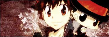
(different placing of smudge layer + white, and a little nudge to the left, and some other random effects that I particularly couldn't remember)

I seriously need more training other than doing headers for livejournal. .___. comments. critiques. whatever you think is wrong with those two. PLEASE. And tips, while you're at it.

Oh, and forgive the lack of a decent flow.

(zetsuboushitaaa~ -bangs head on desk-)
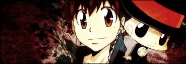
 

Salty the Hero

self loafer
Joined
Mar 18, 2007
Messages
3,591
Awards
1
Age
30
V1, IMO.

What you did in V2 is a little random.

You should also try giving a small light source for the first one.

Good job, tho.
 

Rae

AYY FUTURE FISH
Joined
Mar 8, 2006
Messages
851
Age
29
Location
Deep in the hundred acre wood where Christopher Ro
Website
kurotofu.tumblr.com
Wev, while I myself get rather happy hearing someone saying 'awesome' to me, I think I'd appreciate it if I get...well, something more...umm...'building'? And I fully blame Hitman Reborn along with Fran's frog hat for the title x3

I actually thought the same, Salt. I was trying to make the second one more 'bright-and-color-wise' since I thought the first one lacks good color. -w- So, anyway, I've tried to brighten v1, but what I've done are mostly ruining the saturation and--at the same time--the whole tag. Any idea to brighten it without saturating the base stock? x_x I couldn't think of any, apparently .__.
 

Salty the Hero

self loafer
Joined
Mar 18, 2007
Messages
3,591
Awards
1
Age
30
I`ve tried but it didn't really help:

x1.png


Though I advise you to try Gradient Maps if you problems with coloring. It could probably help you.
 

Rae

AYY FUTURE FISH
Joined
Mar 8, 2006
Messages
851
Age
29
Location
Deep in the hundred acre wood where Christopher Ro
Website
kurotofu.tumblr.com
Mmkay...while I didn't exactly get anything with the gradient maps (-w-)...I actually got an idea from the gradients.

*meddled with v2 -since I forgot to save the psd for v1- and got these two*

1. Switched back the smudge layer position into multiply on top of stock, redid the smudge a bit, meddled with coloring etc. etc.
x3.jpg


2. Switched back smudge layer, meddled with base stock's brightness+contrast, etc.
xcopy.jpg


Any better? I just couldn't seem to find any way to brighten by adding gradient layers here... -reason why the gradient map just couldn't seem to work-
 
Status
Not open for further replies.
Back
Top