
• Hello everybody! We have tons of new awards for the new year that can be requested through our Awards System thanks to Antifa Lockhart! Some are limited-time awards so go claim them before they are gone forever...

    CLICK HERE FOR AWARDS

::Digital Artwork:: ~ The Heartless Prince


REGISTER TO REMOVE ADS
Status
Not open for further replies.

Heartless Prince

New member
Joined
Jul 22, 2009
Messages
26
Age
36
Location
Charleston, SC
Website
shinzart.com
roxaskick.jpg


axelpissed-1.jpg
 
Last edited:

Heartless Prince

New member
Joined
Jul 22, 2009
Messages
26
Age
36
Location
Charleston, SC
Website
shinzart.com
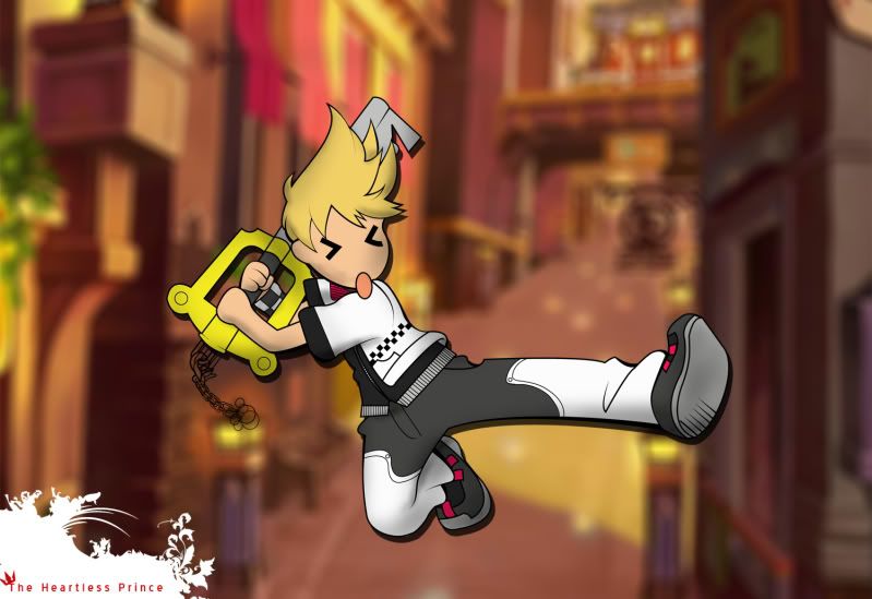
I didn't complete the keychain. I'll repost once I have. I sketched the pic of roxas, pen tooled him, then created some contrast to his outline using average and outline stroke, then I created a colour layer below the pen layer. Photoshopped the shading and background.

~J
 

Salty the Hero

self loafer
Joined
Mar 18, 2007
Messages
3,591
Awards
1
Age
30
Looks alright, but that white brush thing is distracting and doesn't look good, imo.
 
D

Deleted member 36435

Guest
I think the background is a little to blurred and it's hurting my eyes. Sharpen it up a bit.

Looks alright, but that white brush thing is distracting and doesn't look good, imo.
That is essentially his signature or logo. Why should he remove it?
 

Vossler

I'll Be His Successor
Joined
Oct 7, 2008
Messages
8,159
Age
31
Location
Italy
Looks alright, but that white brush thing is distracting and doesn't look good, imo.
That is probably just the way he signs stuff, don't really think that it was meant for flow or anything.
 

Salty the Hero

self loafer
Joined
Mar 18, 2007
Messages
3,591
Awards
1
Age
30
It's just it looks a bit annoying, but that doesn't have anything to do with critique...

Anyway, it is a pretty good sketch. I'd work on the mouth a bit, however.
 
C

Charlie

Guest
The shadowing on his face makes him look like he was playing around in charcoal, thinking it was coke.
 
Status
Not open for further replies.
Back
Top