
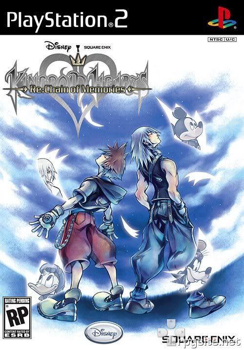
This is exactly what I was going to say lol. It`s very nice box art of course (as usual) but I really was hoping that it would involve Axel (and the other org members) because their a big role in the game. But of course, I still really like the cover =]I like the box art alot, but I would be much happier if it had all of the organization members that where actually in the game, otherwise the cover is pretty cool, alittle to bright for my taste but who cares.
You are using an out of date browser. It may not display this or other websites correctly.
You should upgrade or use an alternative browser.
You should upgrade or use an alternative browser.
What do you think of
- Thread starter Shadow_
- Start date
|
REGISTER TO REMOVE ADS |
|
- Status
- Not open for further replies.
IT LOOKS GOOD BUT THEY SHOULD PUT MORE CHARACTER LIKE ORG13 MEMBERS OR CASTLE OBLIVION THAT WOULD HAVE BEEN BETTER AND YEAH IT IS TOO BRIGHT BUT THEN WHEN YOU PASS BY THE GAME YOU NOITCE!
Castle Oblivion would look awesome<! But I must admit that I pretty much like it the way it is. It's a reasonably good box art, as should be expected ^-^
I think that the KH2FM+ cover is better than the KH2 cover
Yeah, I think that too.
- Joined
- Oct 14, 2008
- Messages
- 385
Its alright. I just got my copy of FM+ and I noticed that they used the Backgroung pic for it. XD I never noticed before.
It's not exactly the same. FM+ has a heart in the clouds, and this one doesn't.
Anyway, it's okay. Not exactly OMGZ but it's pretty cool nonetheless.
- Joined
- Sep 2, 2008
- Messages
- 5,591
- Awards
- 2
Yes the Box art is pretty cool, could of been better if it had a heart, or atleast some of the organization members, who knows maybe this could be a hold box art, and maybe release something new later on, when the game actually comes out.
- Joined
- Sep 2, 2008
- Messages
- 5,591
- Awards
- 2
It doesn't look bad at all.
yeah personally I thought it look incredible when I first saw it, I was really surprised at it, The brightness just gives the game a cooler look, but I can see why some people hate the brightness.
yeah personally I thought it look incredible when I first saw it, I was really surprised at it, The brightness just gives the game a cooler look, but I can see why some people hate the brightness.
lol yeah if your sensative to light lol but if the make it kinda reflective like KH2 then it may pose a problem.....
Both RE;Com and Final mix have brilliant box arts in my opinion.
- Joined
- Mar 29, 2007
- Messages
- 3,003
- Awards
- 5
I like it.
Riku is so Diesel. XD
Riku is so Diesel. XD
- Joined
- Oct 18, 2008
- Messages
- 4
- Age
- 28
it's ok but i think it could use more stuff
- Joined
- Mar 18, 2007
- Messages
- 3,591
- Awards
- 1
- Age
- 30
I like it.
- Joined
- Nov 12, 2008
- Messages
- 888
- Awards
- 4
- Age
- 33
- Location
- South Lake Tahoe, CA
- Website
- www.youtube.com
I think it looks good. But to be Honest, the best KH Box art in my opinion is the Kingdom Hearts II Final Mix+ Box art.
i think it looks great  but tey couldve put Axel as one of those shiny cards on the front
, but i look good overall.
So true XD
but tey couldve put Axel as one of those shiny cards on the front, but i look good overall.
It does look fairly good. It's not exactly as good as KH1's or KH2's, but it's what's inside the box that counts. :thumbsup:
So true XD
It looks sick but something's missing...can't put my finger on it.
Axel
Last edited by a moderator:
I really like it. It looks better than KH1's cover. Good colors too.
Why would it look lame? Chain of Memories was awesome, it deserves good box art.personally I was very surprised at it, I thought it would look much more lamer
To be honest, this might be my most favorable Kh box art. Although, Kh2 box art does put up a good fight.
this cover
 is okay (seen better)
- Status
- Not open for further replies.