
You are using an out of date browser. It may not display this or other websites correctly.
You should upgrade or use an alternative browser.
You should upgrade or use an alternative browser.
Wallpaper for Dream Drop Distance!
- Thread starter D.D.D
- Start date
|
REGISTER TO REMOVE ADS |
|
- Status
- Not open for further replies.

- Joined
- Mar 9, 2006
- Messages
- 2,881
- Awards
- 1
that's a small wallpaper
(ASSUMING THIS WASN'T SARCASM) right click + view image, or something to that effect depending on your browser idk. the site scales images down to prevent page-stretching.that's a small wallpaper
- Joined
- Mar 9, 2006
- Messages
- 2,881
- Awards
- 1
it was. lol. in all seriousness, sora looks lq compared to everything else around him. also the fact that his hair and shoe are just baaaarely cut off drives me crazy. those big circles are distracting. and that part next to his right foot also just cuts off rather suddenly. weird light, too.
it was. lol. in all seriousness, sora looks lq compared to everything else around him. also the fact that his hair and shoe are just baaaarely cut off drives me crazy. those big circles are distracting. and that part next to his right foot also just cuts off rather suddenly. weird light, too.
The part that cut off his foot was in the render, lol. I saw it and I was like, "Is this the way Nomura drew this or what?". Probably not.
Wait....
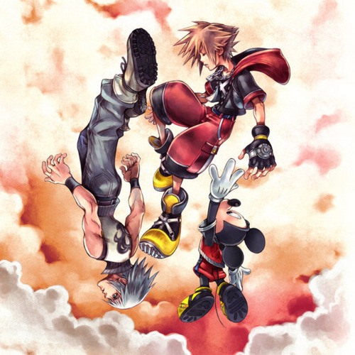
He did draw it flat. Shame on Nomura, lol.
But yeah, with the lighting it was kinda tough because I hadn't done any prep lighting layers before and just added it on to the end, so yeah... I'll admit that, lol.
Light is too bright on his face. Everything else I can dig. The logo would be best a bit smaller, and I think it would work. Also, fix that cutting off. Reducing the size of sora by 5%(meaning typing in the resizing as 95% both horizontally and vertically).
All-in-all, it's a nice wallpaper.")
All-in-all, it's a nice wallpaper.
^ I agree on the light in his face, it's a little too bright. I prefer the non logo version over the logo version but that's a matter of opinion (I like simple). I love what you did with the colors although I'm wondering how it'd look like if you used lighter colors. But you did a very good job on this, I really like what you've done with it!
Light is too bright on his face. Everything else I can dig. The logo would be best a bit smaller, and I think it would work. Also, fix that cutting off. Reducing the size of sora by 5%(meaning typing in the resizing as 95% both horizontally and vertically).
All-in-all, it's a nice wallpaper.
Yeah, I always have problems with too bright light, lol. I'll have to keep working at it. But thank you for the compliment.
^ I agree on the light in his face, it's a little too bright. I prefer the non logo version over the logo version but that's a matter of opinion (I like simple). I love what you did with the colors although I'm wondering how it'd look like if you used lighter colors. But you did a very good job on this, I really like what you've done with it!
And the lighting thing I do understand. I actually, while making it, was debating between making it darker like it is or more like the clouds on DDD's cover and lighter.
But thank you for liking it.
- Status
- Not open for further replies.