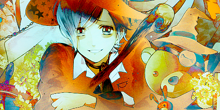
First, #4
This image has a really great sense of light and of movement, which makes it quite compelling. I think the choice of the light source was well placed in that it highlights the most interesting shapes of her face (the curve of her shoulders, her slight neck, and those amazing cheek bones). However the more I look at it the more I do wish that the light faded out and covered more area - rather than being so intense in that small of an area. I also question the use of that pink but it seems as though you pulled it from her lip colour, however I do think that the range of blues you have throughout is really rather beautiful. Overall, it's apparent that there's a lot of work put into it and some really smart choices were made - well done.
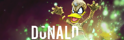
Second, #1
There are two things that this image really has working for it, the placement of Donald and the colour scheme used. It's simple, but I believe most if not all of the elements compliment each other well. Donald himself is very dynamic, which is played up with the use of the green orbs, as well as the colours all complimenting each other and adding subtle moments of soft contrast. When it comes to the text I'm conflicted in that I understand the purpose of it and I visually like what it's doing, but I also don't much care for it and think that it disrupts the composition more than it compliments it.
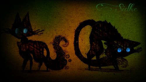
Third, #2
I admit it was difficult for me to decide between the rest for this spot, and I think it came down to a more subjective pull than anything else. I keep gravitating towards this image, and it's mainly for the subtle hints at cat sidhe or just sidhe lore in general - which I think was a smart/creative move given the theme of the challenge. I think what it may lack in any sort of complicated "techniques" used in tag making it makes up for in still having a healthy amount of visual information and a sort of mood and aesthetic. I think the colours work well together and allow for the blue in either cat's eyes to glow and contrast that orange while still being close enough to the green so it isn't too much of a stark contrast. I do think that the text is important within the image, though I think a change in it's placement could work more for it. I also agree with what's been said about the harshness of the black around the edges, it should be more subtle. Otherwise, the image as a whole is appealing and has a nice narrative behind it.


")