
You are using an out of date browser. It may not display this or other websites correctly.
You should upgrade or use an alternative browser.
You should upgrade or use an alternative browser.
Sora fan art, for once.
- Thread starter ♥
- Start date
|
REGISTER TO REMOVE ADS |
|
- Status
- Not open for further replies.

I think it is interesting how you did Sora's hair. I also like the drawing style. It is different from all the styles I am use to seeing Sora in. The coloring looks nice and the pose he is in looks awesome. I like how unique it is compared to other Sora drawings I have seen, so great job.
- Joined
- Apr 25, 2011
- Messages
- 1,665
This has to be exactly what I would think Sora to really look like, yet his red cheeks and nose kind of irritate me.
- Joined
- Apr 25, 2011
- Messages
- 1,665
Well, now when I look at it, the thing that truly annoys me is his lips. Too pink/big, imo, but I love this nonetheless. It's pretty amazing.
i'm a sucker for lips. I guess they don't get represented enough in fan art because the majority of people who draw anime don't know what the hell they're doing and they limit them to just a line under another line and it frustrates me so much because lips are my favorite part of the face so i admit that sometimes i go overboard on them
even when i think i'm being subtle with them
even when i think i'm being subtle with them
- Joined
- Apr 25, 2011
- Messages
- 1,665
I do agree that a simple line doesn't really suffice, but when the color for the lips is so deep, it just tends to stand out and annoys me, imo.
I like it when people try to add more detail or accent the mouth/lips as long as they do it right. I try to do this, but somehow it turns out wrong or weird looking most of the time. It can be hard to do it right. Although I think the lips should stand out more on a female character rather than a male character because females generally have more noticeable lips. That is just my opinion though. I think Sora's lips might be just a little bit overdone here, but they do not look bad to me.
Really great job.
Really great job.
- Joined
- Apr 25, 2011
- Messages
- 1,665
I like it when people try to add more detail or accent the mouth/lips as long as they do it right. I try to do this, but somehow it turns out wrong or weird looking most of the time. It can be hard to do it right. Although I think the lips should stand out more on a female character rather than a male character because females generally have more noticeable lips. That is just my opinion though. I think Sora's lips might be just a little bit overdone here, but they do not look bad to me.
Really great job.
I've noticed in various works that females have larger lips, whilst males tend to have a simple line or two.
I've noticed in various works that females have larger lips, whilst males tend to have a simple line or two.
That is what I was pointing out. Females in general have larger lips than males, so that is usually the case in artworks. Although there are plenty of males with large lips as well.
- Joined
- Apr 25, 2011
- Messages
- 1,665
All I will say is that I would have made the lips a tad thinner. Not dissing on your artwork, because I would love to be as good as you. (or even know how you did it lessons please)
i like the lips :3 Lips are my favorite thing to draw as well =D
Overall, I really like this. it looks like Sora was fighting. The only complaint i would have is his pants since they look a bit too straight rather than being narrow at the top and ballooning as they go down, but i never liked Sora's pants to begin with xD
Overall, I really like this. it looks like Sora was fighting. The only complaint i would have is his pants since they look a bit too straight rather than being narrow at the top and ballooning as they go down, but i never liked Sora's pants to begin with xD
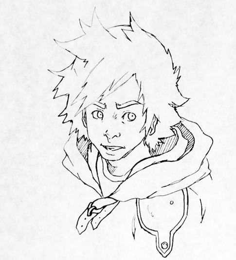
that is REALLY good. I really like your style. *admiring nose and overall expression*
This is a very intriguing work of art. It is heavily based on your art style rather than imitating Nomura's. Makes me think of a cosplayer who has a slightly smaller costume than normal, but I like this.
For visual composition, I think it looks alright. You don't have him in the center of the piece, so you did well there. The background is rather bland, but it compliments the yellow staps on Sora so it doesn't make the background alienated.
The only things I can see that may hinder the picture are: His arms are a tad long and his forearms are a tad short. Essentially, your elbow is where your naval is, and they seem slightly lower.
His face as a whole is smaller in proportion than the rest of his body, but this is subtle.
Anyways I enjoyed this work, very nice. Reminds me of a Samurai Shamploo version of Sora. xD
- Joined
- Jun 30, 2008
- Messages
- 12,681
- Awards
- 44
- Age
- 25
It has to be the most unique Sora fanart I've seen so far, realistic, the cheeks are a slight distraction, and Sora looks a lot older. But with all of the chibi anime styles I've seen, this is a nice departure from the norm and is a great piece of art.
- Joined
- Apr 25, 2011
- Messages
- 1,665
Me likey. I love your work because it shows so much life
- Status
- Not open for further replies.