
You are using an out of date browser. It may not display this or other websites correctly.
You should upgrade or use an alternative browser.
You should upgrade or use an alternative browser.
Random Tags
- Thread starter Geocillin
- Start date
|
REGISTER TO REMOVE ADS |
|
- Status
- Not open for further replies.
- Joined
- Apr 5, 2006
- Messages
- 4,628
- Location
- On the outer rim of the local ghetto
- Website
- kazu52.deviantart.com
Can I wear the sprite tag?...................please
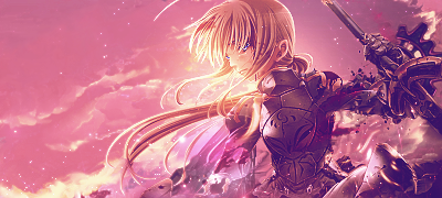
For the first, it's way too bright in the pink on the top left. You have like a gradient thing going on on the right, but it just starts to hurt. I understand what you're doing with the sky, but yeah, its a little too pink.
Second isn't bad, it's just really boring. I guess because a 1/3 of the tag is flat.
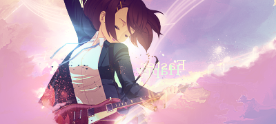
The last one is nice, but the sprite sticks out like a sore thumb. Not blended in well enough at all.
Second isn't bad, it's just really boring. I guess because a 1/3 of the tag is flat.
The last one is nice, but the sprite sticks out like a sore thumb. Not blended in well enough at all.
Your better with pastel colors than anybody else I know.
Lol as far as an abstract if you want something successful, burning/dodging and saturation will help refine your focal.
Loving the sprite tag. Edges could stand to be darkened
Lol as far as an abstract if you want something successful, burning/dodging and saturation will help refine your focal.
Loving the sprite tag. Edges could stand to be darkened
- Status
- Not open for further replies.