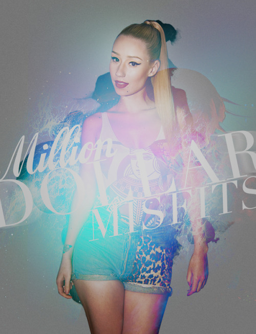
-cracks knuckles-
the lighting against the hair, top right, isn't cohesive with the light blue overlay/gradient map which creates disunion in that area.
The overall lighting actually steals depth from your piece, so it feels flatter than it really is.
I recommend burning in of the anatomy to bring back your stock's dimensions
Fix the lighting a tad
the dark red patch intersecting with the blue next the face is REALLY noticeable bro. Thats bad.