
You are using an out of date browser. It may not display this or other websites correctly.
You should upgrade or use an alternative browser.
You should upgrade or use an alternative browser.
Hey, Whats the big idea!
- Thread starter Kiba
- Start date
|
REGISTER TO REMOVE ADS |
|
- Status
- Not open for further replies.
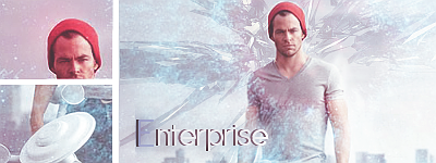
Slices aren't a good idea unless they add something to a concept piece. You just end up distracting from a focal point and ruining flow. I'm not entirely positive about this because it's so bright, but it looks like you took a render and lightened it over a stock. As for text, here's the same old rule and advice: It should be a part of the tag, not just pasted over it.
When I said render I was referring to what I guess you would call a "C4D".

Please do try and take advice into consideration if you're going to modify a graphic or make something new. It's nice that you thanked me but it would be nicer to see you take something out of the comments you receive.
I do take you advice into consideration! ^^ I just didn't know what to do with the other stuff so I focused on making it not seem so bright!
I do enjoy your crit though and definitely take it into consideration.
EDIT:

Mkay, after taking you criticism I did another one! ^^
I like it better!
I do enjoy your crit though and definitely take it into consideration.
EDIT:
Mkay, after taking you criticism I did another one! ^^
I like it better!
Last edited:
- Status
- Not open for further replies.