• Hello everybody! We have tons of new awards for the new year that can be requested through our Awards System thanks to Antifa Lockhart! Some are limited-time awards so go claim them before they are gone forever...

    CLICK HERE FOR AWARDS

epic master xehanort sig


REGISTER TO REMOVE ADS
Status
Not open for further replies.

Thrax

New member
Joined
Dec 4, 2007
Messages
763
Age
31
Location
Switzerland - Zurich / Canada - Scarborough (TN)
mxsigKopie.png


just for fun, very simple one.

TX on the left is my waterproof.

and a prince of persia sig
prince.png

princeKopie.png

two versions.
it was a gift for a guy called Dude.
 

Vandread

Impossible Soul
Joined
Sep 14, 2005
Messages
8,605
Awards
2
Age
33
Website
www.facebook.com
The first one is "epic" by what standard?

Also, the second/third one is better than the first, though not great, but they need to be seriously scaled down to normal size.
 

Lancelot

It's the only NEET thing to do.
Joined
Dec 23, 2007
Messages
9,638
Awards
3
You sharpened the stock of the second/third ones waaaaaaaaaaaaaay way way too much. If it was an effect it might be a bit different
 
C

Charlie

Guest
To be honest, both pieces, included the second version there need serious work.
They should be scaled down to something smaller, so the eye won't be so overwhelmed by the effects. The detail comes out stronger this way, trust me.

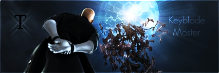
The first tag..has too many scattered and unconnected, choppy, and a questionable combination of effects.
I can see what you were getting at there in concept, but you'd need something branching out of him in order to create some sense of flow to all of it. Rather than it just being, boom - light, boom - text, boom - KH render, boom - random distorted shit in the center. There's nothing in that tag that syncs together to give it unity.

That "T" needs to be scaled down a bit, and should be brought to the right side, underneath that KeyBlade Master - text you have going on. Having it on the left side is pointless, and looks as if you just used it as a filler for the lack of anything on the left side.

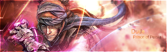
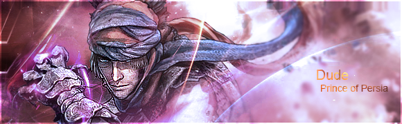
The second tag, with both versions..look choppy, saturated, and monotone.
Even though the first version has more life to it, I'd suggest playing with Curves and Levels to bring in more contrast to help balance all of those smudges and distortions going on back there. Get rid of that border too. If anything, transparent borders usually ruin tags, IMO.


2nd tag looks like it could be decent.
But in no way, shape, or form..do either of these deserve the title of 'epic.'
 

Thrax

New member
Joined
Dec 4, 2007
Messages
763
Age
31
Location
Switzerland - Zurich / Canada - Scarborough (TN)
Now I have time to comment your comment.

Well, the Xehanort sig, it was so simple, I didnt used any C4D nothing. I just took the stock, I made it more darker, and then I brought the ball to glow out. Then, the color was k, I just wrote Xehanort up there, its almost hidden chch, and Keyblade Master I like that font, and the place where it is. And T X is a sign for Thraxes but I think that is k. I will not edit it anymore.
The sig of prince of Persia was way harder. I worked maybe 2 hours on it, and I am not very satisfied with the outcome, and I dont like that size but the guy who has requested that, wanted 580x180.
 
Status
Not open for further replies.
Back
Top