Not trying to be too negative but:
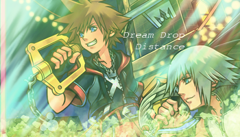
- That text looks like it was slapped on there at the last minute. It's devoid of any blending techniques. It was placed well though, but I think you could have used a better selection of font.
- The leaf-like pattern across the bottom doesn't seem needed. It's covering up some of Riku, which just looks unappealing to me.
- There's an overall lack of emphasis on Sora or Riku, which I think is needed. The texture placed on top is covering the whole tag evenly, which is not good because you have two very obvious focal points in that stock. Mess around with it a bit more so Sora and Riku "pop."