Hello everybody! We have tons of new awards for the new year that can be requested through our Awards System thanks to Antifa Lockhart! Some are limited-time awards so go claim them before they are gone forever...
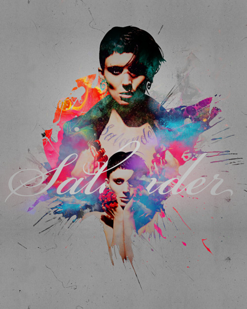
Cool but I can't for the life of me read the text in it fully, though I like the placement. The shape to top right corner-ish seems a little distracting, but I'm sure someone else would say it accents it a little in tune with the general look of the piece.
I think it would be a lot better if it was brighter (ie see clouds stuff so make it blindingly light no jk dont do that). But seriously, make it brighter yo
Try implementing this on a more controversial(color-wise) background, you may find it with more desirable results instead of the plainness of white, all the time lol.