In all honestly, if you read my post in the announcements at all, you'd see where I set you're yet to be refined. Now, what that means is you have potential, as is clearly evident by some of your tags, and especially the OP tag.
Now, since this will take the shortest time- the 3-set tag's best is the last one. Simply because it is the cleanest, most appealing combination of colors and contrast. Whilst you may prefer the colors in the in the second or effect from the first, the third is actually the most "professional" looking piece, if you understand what I'm trying to say here. Whatever gradient map or channel mixing you applied works best in #3.
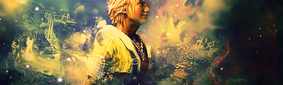
Now for the Tidus tag: First thing's first, parts of it way oversharpened for what they are. The top left side of that stuff/effects is just overdone. I do like your colors though. Actually, you should be rather proud of yourself for the mixture of colors and lighting. The green on the right mixes beautifully with the green on the top left.
Now there should be more foreground in the fushia area. I suppose you're trying to do waves there but they're way too sharp in most spots and if you want a more even feel you're going to need to fill that space on the left side there a little bit (more) because it feels a tad empty, which is kind of causing this to not feel as complete as it could.For the white, try to steadily even that back out into the background, and perhaps try and add something on that side behind or coming from behind is arm there- I feel it could give it a lot more depth.
All to think about but remember, I don't comment much anymore about tags. Means I think you might actually have something with this.